Sunday 19 October 2008

The Mobile Web and URLs

One of the issues floating around my head while I enjoy a quiet Sunday afternoon is what to do about a site's url when its mobile baby brother comes along?

Website addresses already cause a lot of confusion (Was it .co.uk; .com or .org...?), but typing on a keyboard means it is fairly quick to try different options, and google usually lends a helping hand if we get it wrong.

What's more, having to type "http://" thankfully died long ago and a lot of sites forgive you for not typing "www.".
So, basically URLs have got quicker and shorter and so much the better.

Not so it seems with the mobile web: a few I've accessed require the http://www. and produce an error without it! Not great when typing on a mobile. Furthermore, if you type the usual url you may have to endure error messages, over-sized text and images and extreme levels of scrolling unless the site has been adapted for mobile access.
If there is a mobile web version, you may not get redirected automatically or even offered that alternative as you enter the site.

Furthermore, it seems there are already a number of variations at large in regard to the url for mobile versions: some web addresses end in .mobi, others in .mobile, some begin with an m. and some stay the same. Terrific.

So, imagine you've just been given a new mobile, internet enabled and subscription included, and you want to start surfing. You want to check your email and the news and maybe the odd music video.
What would you type?!

Let's look at the pros and cons of each one from the perspective of a mobile user.

.mobi
Pros:
  • It's short and sweet and dodges the whole .com, .es, .org confusion.
  • It's pronounceable
Cons:
  • It's not a proper word, and what's to stop people trying .mob, or .mobile?


.mobile
Pros:
  • It's a proper word so easy to spell AND pronounceable
Cons:
  • It's longer than average (com, net etc) so takes longer to type, -but at least predictive text could guess it.
  • Maybe Americans would want to type .cell and native speakers of every other language their own cultural or linguistic equivalent.

www.m.
Pros:
  • It's slick and sexy, very web 2.0.
  • It's short

Cons:
  • It adds another full stop to the url, which can be a pain to type (did I type a full stop or a comma? where was the punctuation button again?)
  • It can also increase cognitive load and confusion: Do I need to type the www. like in the old days? Did the "m" go before or after the "www."?


Same url for desktop and mobile sites
Pros:
  • The computer does the hard work. You connect from a mobile device, the page adapts accordingly.
  • No extra memorising required on the part of the user.
  • Greater confidence and security that the site really is the site in question, reduced concerns about phishing.
Cons:
  • Doubts about whether the page you're viewing has been adapted for mobile device. Is all the content here?
  • There may be a delay in detecting the correct version (language, device etc)
  • Takes away choice from the user; it's likely that the user will sometimes want to read something they saw earlier that day at work for example.

.com/mobile
Pros:
  • Intuitive, matches the model of pretty urls considered best practice, although it's not strictly the same (it's more of a microsite than a page)
Cons:
  • The length
  • Still have to remember the site's domain
  • Another forward slash


I would personally vote for being offered the option of going to the mobile version when I try to access a site from a mobile (I might not know it exists), and for .mobi or /mobile for being the clearest domains.
That along with punctuating being made easier on mobile devices, and of course for not having to type http://www!

Time will tell which one(s) take!

W3C's Mobile Web Best Practices Course

Having finished the W3C's online course: An Introduction to Mobile Web Best Practices, I have been reflecting a little over the things I have learnt about the mobile (and not so mobile) web.

One of the tasks was to try out 3 of the sites we often use from a desktop computer using either a mobile phone or an emulator. The aim was to discover what works well and what doesn't. Many major sites have serious issues and many cannot even be accessed or viewed properly.

For the experiment I was using mobile emulators rather than real a mobile, which may have effected the conclusions to some degree. Anyway, below I attach the screenshots with comments.

The sites analyzed were: amazon.co.uk, yahoo.com, guardian.co.uk and tumblr.com. Yahoo.com was the clear winner in terms of usability whereas tumblr.com came last!

Amazon.co.uk
Using the dotMobi Emulator

Amazon.co.uk login screen seen on a mobile1. Pages were kept short to avoid endless scrolling, but...

2. there is no visual grouping of the different fields; the question "Do you have an Amazon.co.uk..." looks like it has nothing to do with the email address.

3. What does the bright blue text field mean? Is it disabled or highlighted?

4. The soft key option "More" has nothing to do with what is on screen.


Amazon: Please use the PC site to complete other functions5. It's impossible to know what functionalities and content of the PC version you are going to be able to access until you try.
Although it makes sense to prioritize tasks that can be done on a mobile, it's a little disappointing as a user to not be able to do all the things you would like and are used to doing.


Yahoo
.com
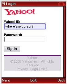
I couldn't log in using the dotMobi Emulator, so I switched to the Opera Mini one.

Yahoo mobile login1. The blue highlighting makes it easier to see where the cursor
is.

2. The slightly larger screen and/or smaller text makes it possible to see the whole login form at once.


3. The content was relevant and nicely thought-out.

4. Horizontal scrolling was avoided.

5. In general the yahoo site seemed well-adapted to mobile use.


The Guardian.co.uk
1. Some familiarity with the PC site is useful to get your bearings. If you're looking for something specific, it may be hard to find it from the home page.

2. A lot of content requires you to sign up, though the advantages of doing so are not made clear.

3. The main menu is quite useful to find a section of interest and then browse within that category.

4. Navigating from one column to the next is not the most natural or the easiest way to move around a page.


5. Once zoomed in, the article summaries and headlines are quite easy to read and do not require horizontal scrolling.


Tumblr.com

The page did not resize to fit the window, making the website extremely difficult if not impossible to use. I had to abandon.


Conclusions:

  • Websites designed for desktop computers do not automatically render and function correctly on mobile devices. In many cases it will be necessary to have 2 separate sites or redesign the traditional site for use on mobile devices.
  • Excessive vertical scrolling and any horizontal scrolling should be avoided as both are hard work on a mobile.
  • Typing should be kept to a minimum as it is also a laborious activity.
  • Related content should be grouped visually as it would be on a desktop site.
  • Images should be reduced to a minimum in size and number and more care than ever should be taken to ensure section titles are easy to understand and links are not broken.
  • Forward and back navigation make correcting mistakes a lot easier.
  • Extensive testing with different mobile devices is needed to make sure content is accessible and the experience satisfying.
  • A website optimized for mobile use is likely to be more accessible to users of assistive devices.
It will be quite interesting to see over the next year or so in what ways usability best practices will differ for the mobile web as opposed to the "non-mobile" or PC-based web. I also suspect - or at least hope - that the demand for the mobile web will improve the accessibility of sites in general.

Sunday 5 October 2008

Forgotten password? Try not to panic, you'll only make things worse

An article in the New York Times, Can't open your e-mailbox? Good luck, reports that many users get locked out of their gmail accounts from typing their passwords wrong one too many times.

The question is, how many times is too many?


In favour of "self-service online support" (blogs, forums etc- very useful as a first port of call), Google claim it's down to the users to provide an alternative email address and/or a security question when they sign up for an account.
Failure to do so can mean weeks without email access.

However, if this is such a common occurrence, I wonder if the importance of this information (for the user's benefit) is conveyed on the sign-up page and whether enough is done to reassure the user that this information is not going to be sold on to third parties - if that's the case.

Furthermore, when you mistype your gmail password, there is no indication of how many goes you get before the account gets blocked. Gmail error message "Username and password do not match": Google login error
Perhaps a little work on the contextual help would get the message across that it's best not to panic and try 50 combinations in swift succession? (as most of us are inclined to do!).

Part of the Google account sign-up form:
Google account sign-up
The security question and alternative email address should possibly be marked as "recommended", or one of them be obligatory. A privacy statement next to the secondary email field could also help build trust.

I suspect a bit of qualitative usability testing, privacy reassurance, encouragement and explanations of why a security question could benefit the user, along with some improved contextual information could help reduce the number of users locked out.

For the remainder, human customer service in the form of email support or call centres could reduce stress for users and get them up and running again in no time. Let's face it, the last thing you need is your email account making you feel guilty and stupid.

Sunday 21 September 2008

Postcard from Croatia

So yes, have been on holiday in Croatia, hence the lack of posts for a few weeks now. Anyway, I thought I'd post a few curiosities that I saw on my travels as I ease myself back into the rat race and face the oncoming autumn...!

Intelligence test no. 1: smiley faces on a ferry timetable:
Ferry timetable
So many numbers on one piece of paper required a process of elimination to separate ferry times from ferries (roman numerals) and what turned out to be the days of the week (1-7). Only then did it dawn on us that the smiley face represented bank holidays!
I guess they were trying to make an international timetable, though maybe a legend or the word "day" somewhere would have helped!


This next one was taken onboard a ferry, the pictures on the side of a door:
Door signs seen on a ferry
I assumed the yellow hinge could have something to do with the arm of the door (not in the shot), but the red question mark got me.
Having been looking at it for several days now I figure it must be a lifejacket. Not a sign that would have been a lot of use to me in an emergency! Also goes to show that context is everything, off a ferry I would think it was some kind of snake!

And finally, a poster with the words "Old is Nice": Old is nice poster
Unfortunately the building had closed up for the night so I couldn't find out what it was referring to. Anyhow, nice sentiment!

Tuesday 19 August 2008

Camera saga part 2

I have of course now found the cable to the camera I lost just over a month ago!!
Still no sign of the camera though.

I have also bought a new compact digital camera and, happily, one with most of my original feature wish list:

1. Viewfinder - yes
2. Video - yes, but I'm still to try it out
3. Price ideally 100 - 150 euros. - 140 euros, right within budget
4. Good flash for nighttime shots. - pub shots ok so far
5. Standard USB cable would be terrific. - yeah! hallelujah!
6. A resistant screen - it actually comes with a sticker I haven't dared take off yet, a bit of a sore point with me and my MP3 player, but that's another story.
7. Robustness - looks like a sturdy little thing
8. Ideally some consideration for durability and/or recycling components, disposing of batteries etc.
It takes normal batteries, so they are heavier to carry, but easy to replace should they run out when I'm out and about. I can use rechargeable batteries and recycle the dead ones. Furthermore, according to amazon.co.uk, this camera is covered by the WEEE Directive.

In case you were wondering, the camera I got in the end is the Canon Powershot A580, good value for money in my humble opinion:
  • It got good reviews worldwide and, because it's a stocky looking thing (compared to say the Canon Ixus 80, which I had my eye on), hopefully it's a bit less thief-attractive too(!). It's definitely the ugly duckling of the Canon compact cameras!
  • Furthermore, the 2 cameras essentially have the same features, (both have 8MP) but the Powershot works out at 17.50 euros per megapixel as opposed to 31.80 euros/megapixel for the Ixus.

I still might hope for the Chocolate 12 megapixel Ixus from Santa for Christmas, it does look lovely, and it is a bit slimmer which is ideal for small handbags and pockets.

A trade-off between increased odds of longevity and divine user experience perhaps?!

Tuesday 5 August 2008

Disaster! lost camera.

...Disaster 2: trying to buy a new one!

- Bizarrely I lost the cable to connect my camera to the computer a few weeks prior to losing the rest of it. So yep, unfortunately I lost a lot of photos too.

So, life being what it is, I'm now in the market for a new compact, digital camera.

But where to begin?


My feature wish list (based on the good bits and bad bits of previous cameras - one a sturdy, little Olympus which took great shots even at night, and a Nikon which had a much bigger screen; great for reviewing everything you'd taken and deleting the rubbish, blurry pics!):
  1. Viewfinder (big screens are great but not in the sun. Seeing as most people use their cameras on holiday, why are there so few with traditional viewfinders?!).
  2. Video (I think they all have that)
  3. Price ideally 100 - 150 euros. I'm an optimist I know.
  4. Good flash for nighttime shots.
  5. Standard USB cable would be terrific; I'd never have to depend on one cable again!
  6. A resistant screen Why should I have to buy a protective sticker?
  7. Robustness - I'm good at dropping things, I finished off my last MP3 player that way. And hey, who wants a camera that breaks the first time you take it out the house or shove it in your bag in a hurry anyway?!
  8. Ideally some consideration for durability and/or recycling components, disposing of batteries etc.
Having that quite clear, you'd think it would be easy to have a quick search online and find one with those features and good reviews.

Turns out it's just about impossible.
  • Different descriptions of the same product list opposing features.
  • Viewfinders are rarely listed on the product specification and not all photos on all sites have a view of the back of the camera. Considering this is where most of the controls are and a photo would give a clear indication of the screen size, (not everyone works in inches and the difference between 2.5" and 2.7" might not be too much of a problem for most people), it's a mystery to me as to why so little importance is given to the rear view. And bad news for me; a camera with a viewfinder puts the price up by 50 - 70 euros.
  • I'm also a little bit unsettled by the distinction between ultra compact stylish cameras and easy-to-use or sturdy ones. Surely these shouldn't be mutually exclusive characteristics?!
  • And don't get me started on different model names for different regions, I spent half a day trying to figure out when the Canon 770IS would be available in Europe. Turns out it already is, it's just called the Ixus 85.
  • Furthermore, most sites let you browse by number of megapixels or price range. The problem I have with this is that surely there are only so many pixels the human eye can appreciate and a few years back, a 3 megapixel camera did the job. Why do I suddenly need 12 megapixels for my holiday snap shots?
  • Secondly, basing my decision on these selections is a bit restrictive, I might be prepared to pay 30 euros more or live with one megapixel less if it works out better value for money.
  • How about a filter "megapixels per euro", or best deal: picture quality for money?
Lastly, here in "We users are lazy", (in Spanish), Olga Revilla points out that it would be great if cameras saved photos with real names rather than with random numbers such as DSC009123.jpg as it would make uploading, filing, tagging and sharing them a dream.
But I guess that's another story!

Clearly there's a lot of work to be done on camera design, websites that sell cameras and ones that discuss them.
We'd better get prototyping!

Well, grumbling over. Back to it!

Sunday 3 August 2008

Reliability + responsibility + time saving = trust + loyalty

A series of recent incidents with banks, online banking and cash machines have left me feeling inclined to withdraw all my money and stuff it into my mattress.

These events brought to mind the importance of trust in satisfying users whatever the situation, whether online banking, e-commerce, GPS, ATMs or bricks and mortar shopping.

Reliability + responsibility + time saving = trust + loyalty
But
Impolite software + uncertainty + time wasting = unsatisfied customer

Alan Cooper’s comments about software also came to mind:
What’s Wrong with Software?

Software forgets
Software is lazy
Software is parsimonious with information
Software is inflexible
Software blames users
Software won't take responsibility
(Alan Cooper, p65, The Inmates are Running the Asylum, SAMS, 2004)

How is this all related?
Let me explain.

1. E-commerce woes
First off, my credit card was declined when I was trying to book some flights online.

I only use my credit card for occasional purchases, such as flights, car hire and online shopping. Seeing as it's with a British bank, I know they will protect me against online fraud. I trust them and that security makes me more inclined to hit Amazon and lastminute.com from time to time.

Therefore, when the bank declined the purchase, I couldn’t figure out what the problem could be as I’m not the type to max out my limit.

Software is parsimonious with information

It turns out it was declined as a fraud prevention measure. - Good to know they do such things, but fairly infuriating to not be able to rely on my credit card for these rare purchases.

Software won't take responsibility

I should point out I have been with the same bank for more than 10 years and I don't think my spending habits have changed in all that time.
When will their system begin to learn and respect my spending habits?


Software forgets
Software is lazy

A day or so later, an overly-dramatic letter (more suited to a spy agency than a bank) arrives at my home address instructing me to phone them immediately.
So, one international call later and I'm set.

Having said that, there was no apology for having had to phone abroad (my time and money) not to mention for having lost out on the flights I had had my eye on (more of my time and money), but at least it seems I can go back to attempting to book flights online.

2. Online banking mysteries
A slightly more worrying incident also involving my credit card occurred a couple of days later following a trip home.
I logged into my account with the intention of settling the difference on my credit card to avoid paying interest (airport shopping is both genius and dangerous when your flight is delayed by 3 hours!).

Surprise no 2: my credit card no longer appeared on my online statement; that line had just disappeared altogether!

Software forgets

I looked for ways to contact the bank or for some other explanation, - I checked the post, I checked my email, nothing!

Software is, once again, parsimonious with information

I found the option "Add credit card to this account", so I figured I'd give that a go, - partly to save on yet another international call - only to be told that I'm not the title holder of MY card!!

Software is inflexible

My only option was to insist that I am indeed the title holder and the computer promised to look into it within 5 days.

Software is lazy

I crossed my fingers and a few days later I logged back in and there was my credit card statement again. Magic.

3. Communication problems
So now I just needed to pay off the balance. I selected "pay credit card", "whole balance" and this time I got the following error message:
"We are not expecting a payment from you. You either have a zero balance or only need to pay the minimum amount".
Now the system is lying to me!? It plainly says amount spent: 60 pounds.

So yes, you guessed it, yet another international call to sort out my "convenient" online banking system.
This time I get put through to a friendly chap called Bob who tells me to pay no attention to unwieldy error messages and to pay the amount of my choosing.
Hmmm. I also mention that my credit card dropped off the system a few days previously and ask whether I should be concerned. Apparently not, happens all the time(!), the credit card company remove them for no apparent reason and the bank people have to put them back on again.

Terrific, instilled with confidence and suspicious that with such high unemployment there could be a lot of cheap, untrained labour about.

If this had been my first experience of this bank, I would have cancelled the account pretty sharply.


Conclusions
“If the interaction is respectful, generous and helpful, the user will like the software and have a pleasant experience.” Alan Cooper
Alan Cooper was talking about software and an interface, but I think we can extend this to include all aspects of user interaction. In the case of banking, this would mean online services, customer service, whether by telephone or in person, queuing times in branches, ATM interaction and availability as well as the product itself; all of which play a part in the user's or customer’s assessment of their experience.

Build trust to increase customer satisfaction and loyalty
In this case my loyalty is dependent on previous problem-free experience and fear of the unknown, (better the devil you know), rather than on having great confidence in this banking system.
It's no secret that trust and successful e-commerce are very closely related; if users don't trust your company, your employees, your payment system, your privacy policy, your returns policy or just don't get good vibes from the look of your website (expired security certificate, inconsistent graphic design of logo, unexplained changes to the URL etc) they'll probably go elsewhere.

Basic trust building guidelines:
In e-commerce there are certain elements or good practices which encourage trust, for example:

  • Transparent privacy policy
  • Up-to-date security certificates and content
  • Consistent graphic design
  • Secure server for transactions
  • No hidden costs (delivery, handling fees, suitcases etc)
  • Honest, Exclusive, Accurate, Relevant and Timely (H.E.A.R.T) content
  • Appropriate behaviour (request for personal details, predictable navigation and interaction)
  • Guarantees

I would add to this list the following aspects which are not limited to websites or e-commerce:
  • Professionalism
  • Competence
  • Reasonable behaviour
  • Personalized attention
  • Excellent customer service
  • Easy and quality communication
  • Fast responses
  • Time-saving
  • Accountability and responsibility

Let’s add to that Alan Cooper’s polite software descriptions:
Polite software is…
  • interested in me
  • deferential to me
  • forthcoming
  • has common sense
  • anticipates my needs
  • is responsive
  • is taciturn about its personal problems
  • is well informed
  • is perceptive
  • is self-confident
  • stays focused
  • is fudgable
  • gives instant gratification
  • is trustworthy
Try to fulfil all 3 wish lists with your products and services in combination and the chances of positive customer satisfaction increase.

The aim of any company surely should be to provide great user experience and satisfaction to convert customers into customers for life and natural promoters of your product. Why settle for the minimum possible, particularly when the standards are so low? Customers should be swept off their feet!


Links:
Other tales of the unexpected with ATM machines were shared here recently:
IxDA Studies on Aversions to Making ATM Deposits.

And for a little story about a friend of mine (July has been a bad month for trust and banks), read my previous entry. This time the story takes place in Spain...

Also see:
Good Usability Practices number 1, from usabilitynews.com, Economic Downturn Puts Website Usability into Focus

Outdated information, number 9 of Jakob Nielsen's
Top 10 Mistakes in web design
(from 1999)

Books:
Peter Keen, Electronic Commerce Relationships, Trust by Design, Prentice Hall, 1999 See a couple of extracts here.
"Certainty, confidentiality, and privacy”

References:
Alan Cooper, The Inmates are Running the Asylum, SAMS, 2004
Chapter 4, The Dancing Bear, p 65 - 69, What's wrong with software?
Chapter 10, Designing for Power, p161, What makes software polite?

Saturday 26 July 2008

A terrible user experience part 1

A true story.

The following took place in Madrid last week. The protagonist is a friend of mine and her story inspired the following cartoon.


ATM robbery cartoon 1

ATM robbery cartoon 2

A little summary in case you can't see the images or understand my cartoons!
  1. Melissa goes to get some money out of a cash point in broad daylight on a busy street in the centre of town.
  2. Two 10 year-old girls approach and one starts messing with the cash machine.
  3. Melissa cancels the transaction, grabs her card and leaves.
  4. Meanwhile the children continue to bang on the machine.
  5. Melissa later discovers 300 euros were withdrawn from her account at the time of the incident.
  6. She reports the whole thing to the police who not only know who the girls are, but have also heard the same story on numerous occasions(!!). They attribute the problem to a known fault with the cash machine and say they are powerless to do anything due to the children's age and on account of it not being a robbery per se!! Apparently banging on the screen or keypad in a certain way, - even after a transaction has been cancelled and the card removed, - can make the ATM spit out 300 euros. This money is then deducted from the last account to use the cash machine.
  7. The bank is debating whether they will return her money or not, but will take a leisurely 1 to 2 months to decide!
Side note.
A lot of the banks in Spain have their cash machines in the entrance hall to the bank as opposed to facing out onto the street itself, (which is standard in the UK). When the bank is closed, you can only get in to get money out by swiping your bank card. Once inside, not only are you on camera, but you also lock the door behind you to stop someone else coming in.

I was always quite puzzled by the logic to this feeling somewhat claustrophobic while being locked in and quite vulnerable to attack when leaving the bank; thinking that people could be waiting just outside to relieve me of my cash.

So, maybe this a chicken and egg situation:
Have robbery techniques developed to take advantage of the vulnerability of the exposed cash points (as opposed to the "security" of enclosed ones)?
Or, have cash points traditionally been kept inside the bank to protect their customers from this type of attack?
And, most importantly, to what point does this affect the assignment of responsibility and accountability for secure, reliable and safe cash point operations?

Thursday 26 June 2008

E-commerce: IKEA getting it right

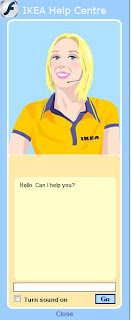
Ikea's virtual assistant I was delighted (or relieved) to see that it is at last possible to buy Ikea products online.

This option, long awaited by the masses, has been surprisingly slow in the coming considering the apparent ease of extending their reach and services while making a fortune for themselves in the process.

And I say "relieved" principally as a non-car owner: the underground journey with a floor lamp and double duvet underarm has never been much fun, and I'll certainly be delighted not to have to do battle with the queues and crowds over a rug when shopping online becomes an option for my neighbourhood.

So, being a bit of a geek I thought I'd check out the online store despite not being able to get a thing delivered at this point in time (love online forms) and, I have to say, I was pleasantly surprised by a number of the services and functions offered.

Always ones for being innovative, their website has a few features that any self-respecting e-commerce site would hope to have, (assuming you have Flash, javascript and so on installed).

  • Their internationally acclaimed "Ask Anna" virtual assistant, (see image above) able to turn around insults and indecent proposals while keeping her cool - even from those most determined to provoke and crash the system - offers useful, polite and friendly advice in real time.

  • The product navigation options also enable a good look at the products from different angles and different situations, thereby enabling the online window shopper to get the best virtual feel for the products possible from a website.

  • You can also download a room planner application should you so desire.

These functions have been on their site for quite sometime.

  • However, this time around an ad for their corporate social responsability campaign "Create a foot of forest" caught my eye.

    Essentially it's a clever loyalty card scheme, (though I don't think Ikea really have any competition, do they?), in which every time you shop, Ikea donates to the Woodland Trust.
    Great idea: it eases the consciences of shoppers buying wooden furniture; creates woodland; the name, "Ikea Family", although at first misleading (I thought it was for parents), adds a sense of belonging; and Ikea get a lot of personal information into the bargain.

  • A further ad announces their fairtrade policy "Low price but not at any price" and invites users to find out more. This kind of transparency is quite a refreshing, particularly when cheap prices these days do so often have a immoral story behind them.

What else do they get right?

  • The full address, directions, a clear map, store opening hours and telephone number found on the same page. A usability basic, rarely well-implemented or complete.

  • Not only do they support national initiatives, but also local ones, details of which can be found on your local store page.

  • Instant stock availability checker for the stores closest to you (although the form could be a little clearer).

  • Transparent delivery prices displayed on the home page.

    Ikea delivery charges

    Oh, and talking of online forms, apart from some slight confusion with the newsletter opt in and accept conditions pop ups which appear at the end of the Ikea Family registration, (Cancel, Back, or Next - no "Accept", is "Back" going to "Cancel" it too?), clear, well-positioned labelling, no distractons, 8/10.

Sunday 25 May 2008

Visual feedback: keeping the user informed

Visual feedback is a one of the most fundamental requirements for successful human-computer interaction, or for human-anything interaction come to that.

An example of poor visual feedback could be my previous laptop or current MP3 player; both have an initial plain black start-up screen. I hit the "on" button and nothing appears to happen, so I hit it a few more times, - probably doing more harm than good,- until at last something changes on the screen.

...and there it is, the key to visual feedback; the fact that something has happened or is in the middle of doing something has to be obvious. If I don't notice that something has changed, I won't know or believe it has.

Seems obvious, right? But so many times the difference is so subtle or so slight that the fact that something has changed goes unnoticed.
We, as users, need the system to tell us its state. A start-up screen of any colour other than black would let me know my hitting the "on" button had turned on the machine and that I should hang on for a second or two (rather than repeatedly hitting the same key harder and harder more and more impatiently!).

Effective visual feedback can be achieved by a change in the layout of the elements on screen, or a change in their colour, tone, size or shape, or a combination of the above, (colour alone is not recommended for accessibility reasons).

Online forms and sign-up processes are common examples of where visual feedback is required in the online world, whether or not it is actually provided. Let's take a look at some good examples:

Linea directa insurance sign up page LĆ­nea Directa Insurance 1

Linea directa insurance error page LĆ­nea Directa Insurance 2
The difference between the first and second screen is immediately apparent on account of the colours and shading. The instructions also indicate the fields which require attention; the user would notice such a change and not expect to see the confirmation screen until she had made the relevant changes.

Facebook wrong password
Facebook, wrong password
Given the site's blue and white colour scheme, a big pink box attracts the user's eye. Helpful hints are also provided to help the user on his way.

My family error message screen My Family sign in page. Another classic use of colour and shading.
The message that appears at the top of the screen makes the rest of the form shift down the page; a movement which attracts the user's attention.
Also notice that the actions buttons don't activate until all the information has been gathered.

Photo bucket error message Photo Bucket's error message goes one step further: not only does it include the standard error icon (an important visual clue) and some alternative user names, it actually points out the field in question so there can be no mistake as to where the error lies. A change in the colours used and shading can also be seen.

Nextel character counter And finally, a step away from error messages, Nextel's character counter let's you know how many characters you have typed (instead of just telling you the maximum allowed). A great help for all of us who do not see communicating an idea in terms of numbers of characters!


Also see:
Jakob Nielsen's Alertbox: Top 10 application design mistakes (mistake no. 4)
Signal vs Noise: Web Interface Design Tip: The Yellow Fade Technique

Sunday 11 May 2008

Trust, asparagus and a little faith in humanity

Aspargus stall outside farmOn a recent visit home to Warwickshire, England, my dad pulled off the road to buy fresh asparagus from a farm.

It was quite a different grocery shopping experience to the average: here there were no queues, no need for debit cards, ID and pin numbers, the stall was left unsupervised and completely technology-free: you pay, take your change and enjoy your asparagus!

Quite refreshing to see in 2008.

Tuesday 29 April 2008

4 causes of daily frustration


I recently published on everything UX's Spanish sister site, todofluye.tumblr.com these 4 everyday objects that are a cause of frustration in my day-to-day life.
  1. The first item are the doors at the entrance to the Madrid underground
    In general the Metro de Madrid trains run very well and the system is kept clean and prices low. However, the doors are extremely heavy and I don't know how people with their hands full or who are physically slight manage!

    Ironically, a few months ago, these blue stickers appeared on some doors claiming they were easy to open; a clear sign that their poor usability is at least recognized by those responsible.

    I seriously wonder if this is a half-started project or a just bad joke; there's nothing easy about opening these doors. The technique required is the same as with the rest of the doors, if someone ahead of you opens one, let the door swing, make the most of the momentum and open it in the opposite direction. If you try and sneak through after someone else, you'll just end up trapped by it (no joke!).

    No evidence of user-centred design here.


  2. The office water cooler
    This machine not only often refuses to pour water, (you have to shake the whole machine to get rid of the trapped air), but it also has a mystery, red emergency button. None of us can fathom out what this button is for!

    An example of the need for designing a product that does it's main function very well, leaving secondary options hidden, though intuitive.


  3. A laptop keyboard with the Function button sitting in the place of the Control button
    This is extremely frustrating when using - or trying to use - keyboard shortcuts. I often end up thinking I've copied some text only to find that I'm typing vvvv instead of pasting!

    A good reason for following standards!


  4. The false checkbox of a pop up window from an antivirus with a trial period
    Q. How can I get rid of this pop up window at start up?
    A. I either have to buy the product, or uninstall the antivirus and download a new one.

    Fair enough, but the false checkbox which cannot be selected - despite its appearance - and the text "Check box to not see this message anymore" has tricked me at least a dozen times into trying to select it!

    Annoying someone into buying your product is not a great user experience!

Saturday 19 April 2008

Exhibition: Utility in Design

Everyday objects which not only successfully combine utility and aesthetics, but are also commercially viable are currently on display in the Circulo de Bellas Artes in Madrid, Spain.

Binaria good posture stool by OkenThe exhibition stems from the idea that utility is the raison d'etre of design and lists 5 sides to utility which, roughly translated, are the following:
  • Appropriate for an end
  • In accordance with the body
  • Easy for everyone
  • According to need
  • To last and be recycled
The exhibition covers a wide variety of objects and gives an overview of the history of the design and development of each item, as well as pointing out the key characteristics that make each one more useful than the average of its kind.

The Binaria stool by Oken, (see picture above), is one example of a product designed to combine comfort with practicality while encouraging good posture.

Among the other items exhibited you can find: Camper shoes, park benches, the Bilbao underground, comfortable scissors and bins that are emptied by underground pipes, avoiding the need for garbage disposal trucks in cities.

According to the online description of the exhibition:
"...this diversity exemplifies the transversal character of the quest for practical improvements in the design and development of new products."
Rodex mop ad of woman mopping kitchen floor in high healsOn a final note, although I appreciate that standing up to mop the floor is a million times better than having to scrub it on your hands and knees, I have to say that the Rodex ad (left) with a woman mopping the kitchen floor in high heels does amuse me! Not the most practical choice of footwear perhaps.
The slogan reads:
"Smile with me if you've already got your Rodex" :)

Links:

The exhibition catalogue (PDF) from the Circulo de Bellas Artes website
A write-up of the exhibition in the newspaper El PĆŗblico (in Spanish)

Saturday 22 March 2008

Quick fixes and laziness

Why do people use things for purposes and in ways in which they weren't intended?

One of the tasks of a psychological study I took part in when I was at university was to think of as many different uses as possible for a object within a 30 second period. I think the object was the cardboard tube from inside a kitchen roll. In theory, the more uses you could think of the more creative or intelligent you were.

So, is using something as a quick fix, a sign of intelligence, adaptability and resourcefulness, or a cue that something needs to be designed (or re-designed) to fill a gap or fix a problem?
Is there an element of being a free spirit or anarchistic by not conforming to the commonplace?
Is it a question of the perceived affordance of the objects exerting an influence?
Could out-of-the-ordinary uses be motivated by consideration for others, or is it simply the result of sheer laziness and thoughtlessness?

Does a quick-fix really deserve such analysis and interpretation?!

Car fender repaired with fur coat and cellotapeKevin Henry for Core 77 looks at 2 sets of photographs (which run in a similar vein to the desire path photos), but with very different interpretations of similar situations: Making Do and Getting By (Richard Wentworth) and Thoughtless Act (Jane Fulton Suri), and considers the reasons behind such actions.

Enjoy!

Friday 21 March 2008

Its "perceived affordance" tells me what to do

A stab at pinning down a term, Definition #1

Perceived affordance is when the appearance of an object suggests how to use the object, without further instruction being required. Note: not all objects have this quality.

Also see: wikipedia's definition (new window).

Thursday 20 March 2008

Desire paths

photo of a piece of grass with one concrete path and one foot-trodden pathIt's not the first time I've seen photos like these used to make a point about usability/(non) user-centred design, but it is an amusing collection of photos and I do love the name: "Desire Paths".

Apart from making me homesick for my native green and grassy England, basically it brings us around again to the idea that if something is not useful or usable, people will find a way around it. If you're going to make people work harder than they need to, think again! And, despite the "correct route" being blindingly obvious to designers, planners etc, it doesn't mean that users are going to "see" it!

These are clear examples of the need for user observation, common sense and user-centred design.

The group says the inspiration came from a book by Nick Crane 'Two degrees west' (Viking 1999):
Claire was photographing desire paths... the imprints of 'foot anarchists', individuals who had trodden their own routes into the landscape, regardless of the intentions of government, planners and engineers... They were expressions of free will, 'paths with a passion', an alternative to the strictures of railings, fences and walls that turned individuals into powerless apathetic automatons.
Call me unromantic, but I'm not so sure about footpath anachism and expressions of free will so much as the practicalities of getting from A to B!

Thanks to the Desire Paths flickr group and to John Gibbard on the IxDA mailing list for bringing this collection to my attention.

Saturday 8 March 2008

Letter to Blogger

Hey guys!

I like the blogger site, it looks good and it's pretty easy to use. But still, with a few tweaks here and then the accessibility of the blogs created would be much better to everyone's benefit.

One thing that's missing are easy-to-add alt tags from the image upload dialogue box:

Blogger dialogue box for uploading an image >>>An alt tag is a description of the image or its purpose. This way, users of screen readers or those with the images disabled know the function of or the information portrayed by the image.

According to the Authoring Tool Accessibility Guidelines (ATAG), all authoring tools, including blogging websites such as this one for example, should make it easy for the author to create accessible content, this includes prompting for alternative information:

ATAG 1. Checkpoint 3.1
Prompt the author to provide equivalent alternative information (e.g., captions, auditory descriptions, and collated text transcripts for video).

ATAG 2.0 (Draft)
Support the production of accessible content
B.2.1 Prompt and assist the author to create content that conforms to WCAG. [Relative Priority]

Currently we have to edit the HTML by hand.
>>>Click on the edit HTML tab and look for: alt=""
Add your image description between the "", e.g. alt="type short image description here"

Of course, if you are not familiar with accessibility issues, you are unlikely to be motivated enough to take that step, - assuming you have the knowledge required to do so.

Please make it easy for bloggers to create accessible content
with an extra "alt tag" field and "What is this?" link in the dialogue box. A couple of examples, e.g. "Blogger logo", "Me blowing out the candles on my ninth birthday" and problem solved.

Blogger, Tumblr, all you other sites out there, please listen, the responsibility is yours!

Read more:
A quick and dirty introduction to accessibility
Introduction to Accessibility from the W3C
Report by Jakob Nielsen: Beyond Alt tags (PDF)

Sunday 2 March 2008

Accessibility, Windows and icons

In the same week that Microsoft announced they are reducing the price of Windows Vista by 40%, I came across this report which takes a look at the differences in the accessibility options of Windows XP and Windows Vista.

The article by Magnifiers.org starts by mentioning a Forrester Research report commissioned by Microsoft in 2003 which found that:
One quarter [of users included in the study] had a visual impairment, nearly the same percentage had dexterity difficulties, and one fifth had hearing problems. [And therefore that] ...nearly two thirds of the survey sample would be likely to benefit from accessibility technology in one way or another. The real eye-opener was that the survey sample consisted entirely of 18- to 64-year-olds.
The good news is this equates to a lot of positive publicity for the need and demand for accessible websites and computer applications.

>>> As a Microsoft Vista user myself, I have to say that I was pleasantly surprised to find so many options available to users. I have tried using them to try to get a better understanding of both the tools available, the advantages they offer and difficulties encountered when using the computer. However, I'll let you read the article for yourselves and come back to my experiments another day.

Peter Verhoeven of Magnifiers.org considered the changes to be a positive move forward and an extension of the previous toolkit.
Windows Vista blue circle and arrows Accessibility Icon
Peter goes on to mention that one of the most eye-catching changes is that the icon of a wheelchair used to represent accessibility options on Windows XP has been changed to one of a round button with arrows on Windows Vista (see picture).

What I found interesting about this is that the wheelchair icon is still found many sites today, in fact I'd say it's becoming more and more common.

I would think this could be on account of google using it on their gmail sign-up page, Accessibility wheelchair icon on gmail sign up as so many people look to google for examples of usable design and best practice.

However,
  1. the wheelchair gives a fairly limited perception - to say the least - of the users who need or are more comfortable using accessibility tools.
    The report mentioned above gives evidence of this as all the difficulties and disabilities mentioned do not imply the users were wheelchair bound, and that accessibility needs are varied.
  2. The icon may confuse, discourage or even offend users from using that option who could benefit from it.
  3. What does it suggest? What tool or feature could it represent?! In the case of the gmail sign-up page, it provides the acoustic version of the captcha. However, if I couldn't make out the captcha or had the images

Conclusions


  • It's great that Vista, with so many more accessibility options than Windows XP, has been reduced in price.

  • Hopefully the change in perception of the accessibility market resulting from the Forrester Research report and Microsoft's efforts will encourage more people to concentrate more of their resources in that area.

  • And finally, let's hope that goes hand in hand with a little more imagination and appropriacy when it comes to designing icons!

Compare your site's SEO with the competition

Interesting report generated by a free online tool which compares the marketing impact and Search Engine Optimisation score of your website and optionally that of the competition. See Website grader

It's nicely written, (it doesn't sound like your typical computer-generated report) and gives you tips on how to improve on your weak spots.

How useful it is, I couldn't say, interesting though, that's for sure!

Saturday 1 March 2008

Video tour of accessibility

Definitely the best and the only way to learn the importance of accessible websites is to see users using assistive technologies for yourself.

Here is a collection of online videos about assistive technologies which do just that.

With thanks to dotjay's lab for putting this resource together.

Customer service 2.0?

Happily it seems some are making the most of email and getting online customer service right.

11870.com is one example of a web 2.0 site with personalized customer service with a human touch.

A couple of days after I signed up and added a few of my favourite bars and restaurants to the listings of 11870, I received an email - shock horror from a real person!! - offering help and encouraging me to keep using the service. Not only that, but she pointed out that they had a help blog where I could go should I need to and, if all else failed, that I should contact her directly.

>>> Interestingly, the help blog was basically a collection of FAQs: a little more organization, regular updates and more dialogue with and between users and this could be the future of website Help sections.

What's more, the email made specific reference to my choice of restaurants, my taste and interests and the tone of the email was in keeping with the website; friendly and approachable.
De todas formas, ya sabes: para cualquier duda o consulta que tengas, me comentas y te echo un cable ;)

...and in English:
Anyhow, now you know, let me know if you have any questions or queries and I'll help you out ;)

Makes a nice change!

Next week they're having a party in Madrid, not sure I'l make it, but I might just give it a shot.

Wednesday 27 February 2008

Why things suck! - Wired Magazine

Wired magazine lists a number of common and yet extremely annoying everyday items Why things suck
Printer cartridges, batteries, photocopiers, car alarms...
Finding the right ink cartridge for your printer can be harder than finding true love...

hehehe

Define graphic design ...graphically!

In a similar vein to the spam art/poems, this "What is graphic design?" poster competition has some really cool, interesting and humorous entries: see http://tiny.cc/posters

Sunday 24 February 2008

Turn spam into art

The words Don't put off your happy life painted colourfullyThe words Say goodbye to Love Failures and Loneliness in a painting


I LOVE this idea of converting spam into cute, quirky designs.

Who would have thought anything positive, beautiful and humourous could come out of spam?!! It's almost poetry!

See Linzie Hunter's Flickr page

Beautiful design of practical objects

Drink selector mug. You can slide metal plates on the mug to reveal the type of drink, how many sugars and black or with milk ...that's not to say that they're cheap!

Smashing Magazine got together a list of 25 objects (laptop cases, speaker systems among others) currently on the market, which combine beauty, style, elegance, in some cases a sense of fun.

Their mysterious product appeal suggests they offer an unmatched user experience. Can't guarantee all that just from the photos of course, but check out the mouthwatering pics anyway.

Among my favourites: attractive oilcloth lunch bags (always a sucker for anything which can be reused and reduces waste); the extremely handy drink selector mug, (see picture) - great for remembering everyone's coffee requests in the office, - and the extremely useful flexible dual screen system (the BTC Dual Monitor 150 DS).

Enjoy!

Thursday 21 February 2008

What makes for good icon design?

A summary from Turbomilk on what does and doesn't work in icon design. Unsurprisingly, many of the general usability guidelines apply.

But Turbomilk suggests taking the following considerations into account:

Simplicity
Recognizability
Style consistency
Ease of differentiation
Cultural localization


Not forgetting, of course, the importance of working on a small scale; resizing a large, (even vectorial) image is gonna look too messy and fussy at 16 x 16 pixels!

Fairly logical stuff, but an interesting read nonetheless.

http://turbomilk.com/truestories/cookbook/criticism/10-mistakes-in-icon-design/

Thursday 31 January 2008

bad usability calenders

Bad usability calendar
so bad you can't even use them to see what day it is!

You can download a calendar in PDF format here: www.badusability.com

(Admittedly a little bit of a geeky, usability consultants in joke).

Monday 28 January 2008

User-centred pen design

writing with a pen between your toesTripod design, Tokyo, has some great user-centred products.

Check out the pens they have made for people who use their feet or mouths to write (see U-Wing pens) or those with weak hands (see Handy Birdy pens); not only do the products look great but everyone is catered for!

Importantly they aim for barrier-free design and say about their Handy Birdy pens:
These were our first products designed based on detailed dialogue with users.
____________

Tripod Design: www.tripoddesign.com/en/home/index.html