Sunday 26 September 2010

UserActionTracer: a tool for improving the quality of online surveys?

There are many pros and cons to collecting user data online, one of the greater cons from the researchers' point of view is the uncertaintly as to whether participants are paying attention and are answering as best they can.

According to the British Psychology Society blog, one new tool may help remove some of those niggling doubts.

The UserActionTracer collects data such as mouse movements, all inserted text, response times, unnaturally fast click-through rates and the selections made to try and identify suspicious changes or unnatural behaviour.

The idea is that this data could be compared to the participant's results and a second source of info, and that this might help to eliminate survey results that are not of the standard desired.

It could also be used prior to the study's launch to see which questions cause users to go back and correct entries, or to click-through without giving the question the thought they require.

Well they do say preparation is everything. Let's hope this tool manages to improve the quality of online research so researchers can more confidently harness the benefits of the internet.

Tuesday 25 May 2010

Focus groups: taking care of the details and the participants

Focus groups are lots of fun and, most importantly, should provide tons of useful information for the client.

However, after each session it's good to reflect on both what could be done better and what went well, both immediately after a sessions as well as after having reviewed the videos.

Here are a few reflections on things that can affect focus group dynamics.
  • Participant profiles
Language skills
It's really interesting working with mixed-nationality groups to see if cultural or working differences lead to different opinions or user needs.
However, language skills must be considered when drawing up the groups so that people understand each other ok and do not feel like they're in an English class!
Slightly smaller group sizes can be a good idea if the users are not super confident or fluent speakers, (I reckon 4 is a good number).
Let's face it, you've got to look after your users, and if they are uncomfortable, then something has gone horribly wrong.
Fewer speakers also gives participants more time to articulate their opinions before the conversation moves on.

Friends, acquaintances or strangers?
Not something you can usually control, but if the ice has already been broken, the discussion can get going much quicker.
Because of this, I don't think it's a bad idea to have participants wait in the same room as the focus group (with coffee and biscuits) before the session starts. People naturally strike up conversation once they find themselves in a shared situation.
- I point out that they should "wait" in the same room as the focus group to not interrupt the social interactions just before the session - this would undo a little the bonding that had begun and also give a greater killjoy sensation of moving from the playground into the classroom.
  • Set up
Room arrangement
It's hard to strike a balance between the oppressive school "spoke only when spoken to" setting and the too casual coffee lounge; you want the meeting to be professional and taken seriously, without people feeling like they have to "get the answers right".

However, whenever possible, I would go more for a coffee house set up than a school one, so that people talk to each other more than they address the moderator.
The moderator should ideally not be saying much at all! For that the group has to be smallish, 5 or 6 people is nice.

Cameras and other intrusive objects
Being recorded is uncomfortable for most people. At least webcams and modern microphones are smaller and therefore less imposing than traditional ones. However, their presence can still be slightly unsettling.
Although the participants must know they are there, it is better if they cannot see the screen so they worry less about looking into the camera and feeling self-conscious.
If the moderator is relaxed in front of the camera and doesn't pay it too much attention, I think this is transmitted to participants.
- It's also ok to admit, as moderators, that we may cringe slightly when seeing ourselves being recorded!

Male voice vs female voices on recordings
This brings me to a more practical point: The difference between male and female voices is huge when recorded, - this can be a problem when people are observing and trying to listen in.
I'm not sure what the perfect solution is unless you know where the women are going to sit and can provide extra microphones near them or you know beforehand you are going to be dealing with a same-sex group.
  • Technique
Pregnant pauses
At first pauses can feel uncomfortable and your instinct might be to fill them rambling a little.
But no!
Hold back (a handy tip I learnt during my teaching days).
Remember that you're asking participants a ton of questions - many of them they will not have thought about before and might need a minute to think about it.
It makes video playback slow, but then that's what editing software is for!

Addressing people by their name
People giggle at first, but if you get everyone (moderator included) to write their name on a card and place it in front of them for all to see, it makes interrupting and referencing other people's comments much easier and more pleasant.
There's nothing worse when you want to mention your neighbour's earlier point, but you can't think of their name for the life of you!
The name writing can also be seen as part of the warm-up, - even though it only takes a second, it loosens up a serious atmosphere.
Furthermore, as the moderator it means you can call on someone who is not saying much, without having to resort to addressing them as "you, sir" - you can't always get everyone's name straight before it all starts.

Timing
Timing is important to get through all your previously defined goals.
Looking at your watch is rude! To avoid looking impatient, hungry or bored, set up a clock where you can see it easily. I take an alarm clock and nobody pays it any attention.

Final note: obviously some of these things are a wish list; you can't always control the set up, the room and the participants, and it's good to be able to get a good discussion going anywhere, but within reason, I think they can help.
Any thoughts?!

Wednesday 7 April 2010

Shock! Horror! Dubious conclusion to Jakob Nielsen's post "Horizontal Attention Leans Left"

"Web users spend 69% of their time viewing the left half of the page and 30% viewing the right half.
[ok so far]
A conventional layout is thus more likely to make sites profitable."
[hmmmmm, profitable?!]

Jakob's conclusion could be right, but not based on this argument alone. It's a bit of a wild leap for someone who is usually so black and white about things.

If he had said:

"Web users spend 69% of their time viewing the left half of the page and 30% viewing the right half. A conventional layout is thus more likely to be more efficient/save users time and energy/make life easier/improve user perception and therefore, possibly as a result make the owners a ton...." well maybe.
And there was me relying on Jakob to keep a bit of discipline and order among a world full of snake oil sellers!!! Hey ho.


What do you think?

Monday 22 February 2010

The long way round is the wrong way round


I'm glad Amazon added the option of "Add to wish list" to their product pages.

Before it was necessary to go into "Wish lists", search for your own list (yes, search!), search for the product (again)...

Well, this was all a few months ago and I can't remember the details, but I know it was a hassle and a chore, - requiring a high level of motivation from the user. - Exactly what not to do if you want someone to use "social web" tools and functions.

So, at least now they show the "add to wish list" on the product page.
It's a lot more comfortable. And there is a drop down if you have more than one wish list. I have a work-related one, a fiction list and another list related to a separate hobby, but could easily have a public "What to buy me for my birthday" list, or a private "gift ideas for grandma" list.

Unfortunately, one big niggle is that if I buy a product, the wish list doesn't automatically update the quantities "desired" and "received", so you have to go through the list manually. The long way round.

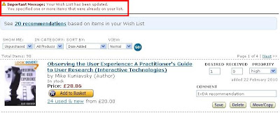
Worse still, I often - unintentionally - try to add new reading recommendations I receive to my long wish list, but which, it turns out, I already added and, as a result, see the nonsensical error message:

"Your wish list has been updated.
You specified one or more items that are already on your list."


Please Amazon:

1. Don't let me try to add the same product to my list twice. It's a lot of clicking and time-wasting.

My ideal solution: Show me which books are already on my wish list on the product detail page. The module is already on the page, but should say "Already added to wish list" or "On your list". Also, on the search results page it would be handy to have an icon or something saying "This is on your wish list".

2. If it is even possible to add more than one book at a time, that could be cool, so tell me about it. I dont recall seeing any way to do that.

3. Please, please, please update my wish lists for me when I buy stuff, or at least suggest that I do it. You could send me an email and say, “hey, do you want this list updating?”.

Saturday 23 January 2010

We are creatures of habit; why it's worth sticking to some design conventions

I was looking to subscribe by RSS to a blog, but could I find the link I was looking for?! A moment of frustration.

Having scrolled up and down, and having tried different pages, I eventually found it.


It's big enough you might think, so why didn't I "see" it, despite having looked at it?
It even says "RSS subscription" in capital letters!

Later that same day I was on another website and found the RSS icon easily, despite it being far smaller.


So, I thought, in the first case the RSS icon might be big, but it's also green and round. For whatever reason, the RSS icon has always been orange, and square:


That must be why I didn't find the first one easily.

However, later that day, yet another site, and this time the RSS icon is square, though small and GREY, almost transparent. And yet I had no problem "seeing" it.

White House grey RSS icon
So, it's quite possible that not only does the colour, size and shape count, but also its location (left / right, top / bottom) and its proximity, not only to the content channel or item in question, but also to other page elements.

All these properties: size, shape, number, colour and location work together to make a familiar element recognisable. Not to the mention the fact that many web conventions shape user expectations (logo linking to home page, banner blindness, pop-up aversion among others).

There are various green circles on the blog (top); all competing with each other for your (my) attention, and blurring together with the branding of the site.
The overall effect is essentially an invisibility shield; impenetrable to the quick scan.

Although there may be aesthetic arguments in favour of a consistent colour scheme and original layouts, there are some design conventions that, for the sake of user efficiency and avoiding frustration, are just worth sticking too.