Wednesday, 4 February 2009

Users @lycos.com, the last to hear about the end of Lycos mail?

Imagine my surprise when I hear from Amazon I had better change my registered email address because in a couple of weeks my lycos email address will cease to exist and I'll be in a spot of bother if I want to buy anything from them!

Luckily for me this makes good business sense to Amazon: much better to send out mails than risk angry and frustrated customers who might just go elsewhere if they can't prove they are who they say they are and clog up customer service resources in the meantime.

But couldn't Lycos mail have sent us a farewell email? a little bit of warning, so we could forward things like mad and update accounts as required?

Or maybe they did and it got filed in their over-zealous spam folder system...

Oh well, goodbye Lycos mail, hello...?

Update!
Clarification straight from the horse's mouth:
" The reports and rumors that you are hearing about an impending shutdown concern Lycos.co.uk and their European services such as Lycos Mail UK (@lycos.co.uk) and the Tripod UK hosting. It is Lycos.co.uk that has announced their shutdown. The UK company licensed the Lycos/Tripod name and some technology years ago, but has NOTHING to do with the original/core Lycos and/or Tripod services that are run here in the USA."

Friday, 16 January 2009

Nerdy film, Helvetica, recommended!

Prompted by the 50th birthday of the Swiss typeface Helvetica last year, the documentary by Gary Hustwit looks at the astonishing prevalence of Helvetica in the signs and logos of the urban landscape that surrounds us.

Those interviewed generally belong to either the Helvetica is great or Helvetica is dull camp: control and restraint versus creativity and free expression, legibility versus visual communication, old versus new - there's no sitting on the fence with this one!

The joy and enthusiasm for the work of the cheerful typeface designers interviewed is definitely the best advertisement I've seen for any profession!

You should at least have a mild interest in design before thinking about watching it...

Saturday, 3 January 2009

The uncertain future of the computer mouse: retirement, longevity ...or evolution?

The computer mouse's 40th birthday has created great debate as to whether it's time for its dignified retirement or whether it could go on to be around for some time to come.

Arguments in favour of its retirement:
  1. Repetitive Strain Injury (RSI)
  2. Anything being 40 years old related to computers is a rare phenomenon, and automatically assumed obsolete
  3. There must be a more futuristic, gestural Minority Report-style alternative, right?!

Arguments against:
  1. It does the job
  2. It's cheap
  3. It's robust. Let's face it, it's one of the few pieces of computer equipment that never breaks

However, what I expect and have been expecting to occur for some time - though it doesn't seemed to have happened - is not for the mouse to retire, but for it to evolve.


Key characteristics of my ideal Future Mouse would be:
  • Future mouse makes use of opposable thumbs (much like a TV remote control)
  • Future mouse doesn't require your arm to be lifted, pushing out your shoulder and tiring your wrist: it would be a lapmouse (goodbye RSI)
  • Future mouse does not require any strength: it requires a gentle squeezing rather than clicking
  • Despite being a lapmouse, it would also work in the conventional manner, on top of the table (it's extremely versatile, you see)
  • It wouldn't feel like such a hard plastic, but more of a ball of putty (could be quite a satisfying combination of a stress ball and work tool, - improving the user experience)
  • Being futuristic, it would of course be extremely green, made of biodegradable plastic perhaps
Well, time will tell...!

However, should the mouse retire suddenly, I only hope individuals, hardware companies and town councils find some way to recycle all that plastic! :-o


Related reading:

Sunday, 19 October 2008

The Mobile Web and URLs

One of the issues floating around my head while I enjoy a quiet Sunday afternoon is what to do about a site's url when its mobile baby brother comes along?

Website addresses already cause a lot of confusion (Was it .co.uk; .com or .org...?), but typing on a keyboard means it is fairly quick to try different options, and google usually lends a helping hand if we get it wrong.

What's more, having to type "http://" thankfully died long ago and a lot of sites forgive you for not typing "www.".
So, basically URLs have got quicker and shorter and so much the better.

Not so it seems with the mobile web: a few I've accessed require the http://www. and produce an error without it! Not great when typing on a mobile. Furthermore, if you type the usual url you may have to endure error messages, over-sized text and images and extreme levels of scrolling unless the site has been adapted for mobile access.
If there is a mobile web version, you may not get redirected automatically or even offered that alternative as you enter the site.

Furthermore, it seems there are already a number of variations at large in regard to the url for mobile versions: some web addresses end in .mobi, others in .mobile, some begin with an m. and some stay the same. Terrific.

So, imagine you've just been given a new mobile, internet enabled and subscription included, and you want to start surfing. You want to check your email and the news and maybe the odd music video.
What would you type?!

Let's look at the pros and cons of each one from the perspective of a mobile user.

.mobi
Pros:
  • It's short and sweet and dodges the whole .com, .es, .org confusion.
  • It's pronounceable
Cons:
  • It's not a proper word, and what's to stop people trying .mob, or .mobile?


.mobile
Pros:
  • It's a proper word so easy to spell AND pronounceable
Cons:
  • It's longer than average (com, net etc) so takes longer to type, -but at least predictive text could guess it.
  • Maybe Americans would want to type .cell and native speakers of every other language their own cultural or linguistic equivalent.

www.m.
Pros:
  • It's slick and sexy, very web 2.0.
  • It's short

Cons:
  • It adds another full stop to the url, which can be a pain to type (did I type a full stop or a comma? where was the punctuation button again?)
  • It can also increase cognitive load and confusion: Do I need to type the www. like in the old days? Did the "m" go before or after the "www."?


Same url for desktop and mobile sites
Pros:
  • The computer does the hard work. You connect from a mobile device, the page adapts accordingly.
  • No extra memorising required on the part of the user.
  • Greater confidence and security that the site really is the site in question, reduced concerns about phishing.
Cons:
  • Doubts about whether the page you're viewing has been adapted for mobile device. Is all the content here?
  • There may be a delay in detecting the correct version (language, device etc)
  • Takes away choice from the user; it's likely that the user will sometimes want to read something they saw earlier that day at work for example.

.com/mobile
Pros:
  • Intuitive, matches the model of pretty urls considered best practice, although it's not strictly the same (it's more of a microsite than a page)
Cons:
  • The length
  • Still have to remember the site's domain
  • Another forward slash


I would personally vote for being offered the option of going to the mobile version when I try to access a site from a mobile (I might not know it exists), and for .mobi or /mobile for being the clearest domains.
That along with punctuating being made easier on mobile devices, and of course for not having to type http://www!

Time will tell which one(s) take!

W3C's Mobile Web Best Practices Course

Having finished the W3C's online course: An Introduction to Mobile Web Best Practices, I have been reflecting a little over the things I have learnt about the mobile (and not so mobile) web.

One of the tasks was to try out 3 of the sites we often use from a desktop computer using either a mobile phone or an emulator. The aim was to discover what works well and what doesn't. Many major sites have serious issues and many cannot even be accessed or viewed properly.

For the experiment I was using mobile emulators rather than real a mobile, which may have effected the conclusions to some degree. Anyway, below I attach the screenshots with comments.

The sites analyzed were: amazon.co.uk, yahoo.com, guardian.co.uk and tumblr.com. Yahoo.com was the clear winner in terms of usability whereas tumblr.com came last!

Amazon.co.uk
Using the dotMobi Emulator

Amazon.co.uk login screen seen on a mobile1. Pages were kept short to avoid endless scrolling, but...

2. there is no visual grouping of the different fields; the question "Do you have an Amazon.co.uk..." looks like it has nothing to do with the email address.

3. What does the bright blue text field mean? Is it disabled or highlighted?

4. The soft key option "More" has nothing to do with what is on screen.


Amazon: Please use the PC site to complete other functions5. It's impossible to know what functionalities and content of the PC version you are going to be able to access until you try.
Although it makes sense to prioritize tasks that can be done on a mobile, it's a little disappointing as a user to not be able to do all the things you would like and are used to doing.


Yahoo
.com
I couldn't log in using the dotMobi Emulator, so I switched to the Opera Mini one.
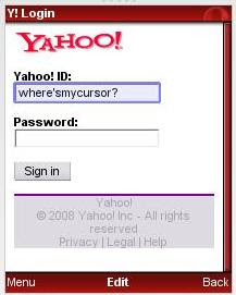
Yahoo mobile login1. The blue highlighting makes it easier to see where the cursor
is.

2. The slightly larger screen and/or smaller text makes it possible to see the whole login form at once.


3. The content was relevant and nicely thought-out.

4. Horizontal scrolling was avoided.

5. In general the yahoo site seemed well-adapted to mobile use.


The Guardian.co.uk
1. Some familiarity with the PC site is useful to get your bearings. If you're looking for something specific, it may be hard to find it from the home page.

2. A lot of content requires you to sign up, though the advantages of doing so are not made clear.

3. The main menu is quite useful to find a section of interest and then browse within that category.

4. Navigating from one column to the next is not the most natural or the easiest way to move around a page.


5. Once zoomed in, the article summaries and headlines are quite easy to read and do not require horizontal scrolling.


Tumblr.com

The page did not resize to fit the window, making the website extremely difficult if not impossible to use. I had to abandon.


Conclusions:

  • Websites designed for desktop computers do not automatically render and function correctly on mobile devices. In many cases it will be necessary to have 2 separate sites or redesign the traditional site for use on mobile devices.
  • Excessive vertical scrolling and any horizontal scrolling should be avoided as both are hard work on a mobile.
  • Typing should be kept to a minimum as it is also a laborious activity.
  • Related content should be grouped visually as it would be on a desktop site.
  • Images should be reduced to a minimum in size and number and more care than ever should be taken to ensure section titles are easy to understand and links are not broken.
  • Forward and back navigation make correcting mistakes a lot easier.
  • Extensive testing with different mobile devices is needed to make sure content is accessible and the experience satisfying.
  • A website optimized for mobile use is likely to be more accessible to users of assistive devices.
It will be quite interesting to see over the next year or so in what ways usability best practices will differ for the mobile web as opposed to the "non-mobile" or PC-based web. I also suspect - or at least hope - that the demand for the mobile web will improve the accessibility of sites in general.

Sunday, 5 October 2008

Forgotten password? Try not to panic, you'll only make things worse

An article in the New York Times, Can't open your e-mailbox? Good luck, reports that many users get locked out of their gmail accounts from typing their passwords wrong one too many times.

The question is, how many times is too many?


In favour of "self-service online support" (blogs, forums etc- very useful as a first port of call), Google claim it's down to the users to provide an alternative email address and/or a security question when they sign up for an account.
Failure to do so can mean weeks without email access.

However, if this is such a common occurrence, I wonder if the importance of this information (for the user's benefit) is conveyed on the sign-up page and whether enough is done to reassure the user that this information is not going to be sold on to third parties - if that's the case.

Furthermore, when you mistype your gmail password, there is no indication of how many goes you get before the account gets blocked. Gmail error message "Username and password do not match": Google login error
Perhaps a little work on the contextual help would get the message across that it's best not to panic and try 50 combinations in swift succession? (as most of us are inclined to do!).

Part of the Google account sign-up form:
Google account sign-up
The security question and alternative email address should possibly be marked as "recommended", or one of them be obligatory. A privacy statement next to the secondary email field could also help build trust.

I suspect a bit of qualitative usability testing, privacy reassurance, encouragement and explanations of why a security question could benefit the user, along with some improved contextual information could help reduce the number of users locked out.

For the remainder, human customer service in the form of email support or call centres could reduce stress for users and get them up and running again in no time. Let's face it, the last thing you need is your email account making you feel guilty and stupid.

Sunday, 21 September 2008

Postcard from Croatia

So yes, have been on holiday in Croatia, hence the lack of posts for a few weeks now. Anyway, I thought I'd post a few curiosities that I saw on my travels as I ease myself back into the rat race and face the oncoming autumn...!

Intelligence test no. 1: smiley faces on a ferry timetable:
Ferry timetable
So many numbers on one piece of paper required a process of elimination to separate ferry times from ferries (roman numerals) and what turned out to be the days of the week (1-7). Only then did it dawn on us that the smiley face represented bank holidays!
I guess they were trying to make an international timetable, though maybe a legend or the word "day" somewhere would have helped!


This next one was taken onboard a ferry, the pictures on the side of a door:
Door signs seen on a ferry
I assumed the yellow hinge could have something to do with the arm of the door (not in the shot), but the red question mark got me.
Having been looking at it for several days now I figure it must be a lifejacket. Not a sign that would have been a lot of use to me in an emergency! Also goes to show that context is everything, off a ferry I would think it was some kind of snake!

And finally, a poster with the words "Old is Nice": Old is nice poster
Unfortunately the building had closed up for the night so I couldn't find out what it was referring to. Anyhow, nice sentiment!