Saturday, 26 July 2008

A terrible user experience part 1

A true story.

The following took place in Madrid last week. The protagonist is a friend of mine and her story inspired the following cartoon.


ATM robbery cartoon 1

ATM robbery cartoon 2

A little summary in case you can't see the images or understand my cartoons!
  1. Melissa goes to get some money out of a cash point in broad daylight on a busy street in the centre of town.
  2. Two 10 year-old girls approach and one starts messing with the cash machine.
  3. Melissa cancels the transaction, grabs her card and leaves.
  4. Meanwhile the children continue to bang on the machine.
  5. Melissa later discovers 300 euros were withdrawn from her account at the time of the incident.
  6. She reports the whole thing to the police who not only know who the girls are, but have also heard the same story on numerous occasions(!!). They attribute the problem to a known fault with the cash machine and say they are powerless to do anything due to the children's age and on account of it not being a robbery per se!! Apparently banging on the screen or keypad in a certain way, - even after a transaction has been cancelled and the card removed, - can make the ATM spit out 300 euros. This money is then deducted from the last account to use the cash machine.
  7. The bank is debating whether they will return her money or not, but will take a leisurely 1 to 2 months to decide!
Side note.
A lot of the banks in Spain have their cash machines in the entrance hall to the bank as opposed to facing out onto the street itself, (which is standard in the UK). When the bank is closed, you can only get in to get money out by swiping your bank card. Once inside, not only are you on camera, but you also lock the door behind you to stop someone else coming in.

I was always quite puzzled by the logic to this feeling somewhat claustrophobic while being locked in and quite vulnerable to attack when leaving the bank; thinking that people could be waiting just outside to relieve me of my cash.

So, maybe this a chicken and egg situation:
Have robbery techniques developed to take advantage of the vulnerability of the exposed cash points (as opposed to the "security" of enclosed ones)?
Or, have cash points traditionally been kept inside the bank to protect their customers from this type of attack?
And, most importantly, to what point does this affect the assignment of responsibility and accountability for secure, reliable and safe cash point operations?
Thursday, 26 June 2008

E-commerce: IKEA getting it right

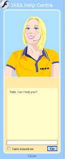
Ikea's virtual assistant I was delighted (or relieved) to see that it is at last possible to buy Ikea products online.

This option, long awaited by the masses, has been surprisingly slow in the coming considering the apparent ease of extending their reach and services while making a fortune for themselves in the process.

And I say "relieved" principally as a non-car owner: the underground journey with a floor lamp and double duvet underarm has never been much fun, and I'll certainly be delighted not to have to do battle with the queues and crowds over a rug when shopping online becomes an option for my neighbourhood.

So, being a bit of a geek I thought I'd check out the online store despite not being able to get a thing delivered at this point in time (love online forms) and, I have to say, I was pleasantly surprised by a number of the services and functions offered.

Always ones for being innovative, their website has a few features that any self-respecting e-commerce site would hope to have, (assuming you have Flash, javascript and so on installed).

  • Their internationally acclaimed "Ask Anna" virtual assistant, (see image above) able to turn around insults and indecent proposals while keeping her cool - even from those most determined to provoke and crash the system - offers useful, polite and friendly advice in real time.

  • The product navigation options also enable a good look at the products from different angles and different situations, thereby enabling the online window shopper to get the best virtual feel for the products possible from a website.

  • You can also download a room planner application should you so desire.

These functions have been on their site for quite sometime.

  • However, this time around an ad for their corporate social responsability campaign "Create a foot of forest" caught my eye.

    Essentially it's a clever loyalty card scheme, (though I don't think Ikea really have any competition, do they?), in which every time you shop, Ikea donates to the Woodland Trust.
    Great idea: it eases the consciences of shoppers buying wooden furniture; creates woodland; the name, "Ikea Family", although at first misleading (I thought it was for parents), adds a sense of belonging; and Ikea get a lot of personal information into the bargain.

  • A further ad announces their fairtrade policy "Low price but not at any price" and invites users to find out more. This kind of transparency is quite a refreshing, particularly when cheap prices these days do so often have a immoral story behind them.

What else do they get right?

  • The full address, directions, a clear map, store opening hours and telephone number found on the same page. A usability basic, rarely well-implemented or complete.

  • Not only do they support national initiatives, but also local ones, details of which can be found on your local store page.

  • Instant stock availability checker for the stores closest to you (although the form could be a little clearer).

  • Transparent delivery prices displayed on the home page.

    Ikea delivery charges

    Oh, and talking of online forms, apart from some slight confusion with the newsletter opt in and accept conditions pop ups which appear at the end of the Ikea Family registration, (Cancel, Back, or Next - no "Accept", is "Back" going to "Cancel" it too?), clear, well-positioned labelling, no distractons, 8/10.

Sunday, 25 May 2008

Visual feedback: keeping the user informed

Visual feedback is a one of the most fundamental requirements for successful human-computer interaction, or for human-anything interaction come to that.

An example of poor visual feedback could be my previous laptop or current MP3 player; both have an initial plain black start-up screen. I hit the "on" button and nothing appears to happen, so I hit it a few more times, - probably doing more harm than good,- until at last something changes on the screen.

...and there it is, the key to visual feedback; the fact that something has happened or is in the middle of doing something has to be obvious. If I don't notice that something has changed, I won't know or believe it has.

Seems obvious, right? But so many times the difference is so subtle or so slight that the fact that something has changed goes unnoticed.
We, as users, need the system to tell us its state. A start-up screen of any colour other than black would let me know my hitting the "on" button had turned on the machine and that I should hang on for a second or two (rather than repeatedly hitting the same key harder and harder more and more impatiently!).

Effective visual feedback can be achieved by a change in the layout of the elements on screen, or a change in their colour, tone, size or shape, or a combination of the above, (colour alone is not recommended for accessibility reasons).

Online forms and sign-up processes are common examples of where visual feedback is required in the online world, whether or not it is actually provided. Let's take a look at some good examples:

Linea directa insurance sign up page Línea Directa Insurance 1

Linea directa insurance error page Línea Directa Insurance 2
The difference between the first and second screen is immediately apparent on account of the colours and shading. The instructions also indicate the fields which require attention; the user would notice such a change and not expect to see the confirmation screen until she had made the relevant changes.

Facebook wrong password
Facebook, wrong password
Given the site's blue and white colour scheme, a big pink box attracts the user's eye. Helpful hints are also provided to help the user on his way.

My family error message screen My Family sign in page. Another classic use of colour and shading.
The message that appears at the top of the screen makes the rest of the form shift down the page; a movement which attracts the user's attention.
Also notice that the actions buttons don't activate until all the information has been gathered.

Photo bucket error message Photo Bucket's error message goes one step further: not only does it include the standard error icon (an important visual clue) and some alternative user names, it actually points out the field in question so there can be no mistake as to where the error lies. A change in the colours used and shading can also be seen.

Nextel character counter And finally, a step away from error messages, Nextel's character counter let's you know how many characters you have typed (instead of just telling you the maximum allowed). A great help for all of us who do not see communicating an idea in terms of numbers of characters!


Also see:
Jakob Nielsen's Alertbox: Top 10 application design mistakes (mistake no. 4)
Signal vs Noise: Web Interface Design Tip: The Yellow Fade Technique

Sunday, 11 May 2008

Trust, asparagus and a little faith in humanity

Aspargus stall outside farmOn a recent visit home to Warwickshire, England, my dad pulled off the road to buy fresh asparagus from a farm.

It was quite a different grocery shopping experience to the average: here there were no queues, no need for debit cards, ID and pin numbers, the stall was left unsupervised and completely technology-free: you pay, take your change and enjoy your asparagus!

Quite refreshing to see in 2008.

Tuesday, 29 April 2008

4 causes of daily frustration


I recently published on everything UX's Spanish sister site, todofluye.tumblr.com these 4 everyday objects that are a cause of frustration in my day-to-day life.
  1. The first item are the doors at the entrance to the Madrid underground
    In general the Metro de Madrid trains run very well and the system is kept clean and prices low. However, the doors are extremely heavy and I don't know how people with their hands full or who are physically slight manage!

    Ironically, a few months ago, these blue stickers appeared on some doors claiming they were easy to open; a clear sign that their poor usability is at least recognized by those responsible.

    I seriously wonder if this is a half-started project or a just bad joke; there's nothing easy about opening these doors. The technique required is the same as with the rest of the doors, if someone ahead of you opens one, let the door swing, make the most of the momentum and open it in the opposite direction. If you try and sneak through after someone else, you'll just end up trapped by it (no joke!).

    No evidence of user-centred design here.


  2. The office water cooler
    This machine not only often refuses to pour water, (you have to shake the whole machine to get rid of the trapped air), but it also has a mystery, red emergency button. None of us can fathom out what this button is for!

    An example of the need for designing a product that does it's main function very well, leaving secondary options hidden, though intuitive.


  3. A laptop keyboard with the Function button sitting in the place of the Control button
    This is extremely frustrating when using - or trying to use - keyboard shortcuts. I often end up thinking I've copied some text only to find that I'm typing vvvv instead of pasting!

    A good reason for following standards!


  4. The false checkbox of a pop up window from an antivirus with a trial period
    Q. How can I get rid of this pop up window at start up?
    A. I either have to buy the product, or uninstall the antivirus and download a new one.

    Fair enough, but the false checkbox which cannot be selected - despite its appearance - and the text "Check box to not see this message anymore" has tricked me at least a dozen times into trying to select it!

    Annoying someone into buying your product is not a great user experience!

Saturday, 19 April 2008

Exhibition: Utility in Design

Everyday objects which not only successfully combine utility and aesthetics, but are also commercially viable are currently on display in the Circulo de Bellas Artes in Madrid, Spain.

Binaria good posture stool by OkenThe exhibition stems from the idea that utility is the raison d'etre of design and lists 5 sides to utility which, roughly translated, are the following:
  • Appropriate for an end
  • In accordance with the body
  • Easy for everyone
  • According to need
  • To last and be recycled
The exhibition covers a wide variety of objects and gives an overview of the history of the design and development of each item, as well as pointing out the key characteristics that make each one more useful than the average of its kind.

The Binaria stool by Oken, (see picture above), is one example of a product designed to combine comfort with practicality while encouraging good posture.

Among the other items exhibited you can find: Camper shoes, park benches, the Bilbao underground, comfortable scissors and bins that are emptied by underground pipes, avoiding the need for garbage disposal trucks in cities.

According to the online description of the exhibition:
"...this diversity exemplifies the transversal character of the quest for practical improvements in the design and development of new products."
Rodex mop ad of woman mopping kitchen floor in high healsOn a final note, although I appreciate that standing up to mop the floor is a million times better than having to scrub it on your hands and knees, I have to say that the Rodex ad (left) with a woman mopping the kitchen floor in high heels does amuse me! Not the most practical choice of footwear perhaps.
The slogan reads:
"Smile with me if you've already got your Rodex" :)

Links:

The exhibition catalogue (PDF) from the Circulo de Bellas Artes website
A write-up of the exhibition in the newspaper El Público (in Spanish)

Saturday, 22 March 2008

Quick fixes and laziness

Why do people use things for purposes and in ways in which they weren't intended?

One of the tasks of a psychological study I took part in when I was at university was to think of as many different uses as possible for a object within a 30 second period. I think the object was the cardboard tube from inside a kitchen roll. In theory, the more uses you could think of the more creative or intelligent you were.

So, is using something as a quick fix, a sign of intelligence, adaptability and resourcefulness, or a cue that something needs to be designed (or re-designed) to fill a gap or fix a problem?
Is there an element of being a free spirit or anarchistic by not conforming to the commonplace?
Is it a question of the perceived affordance of the objects exerting an influence?
Could out-of-the-ordinary uses be motivated by consideration for others, or is it simply the result of sheer laziness and thoughtlessness?

Does a quick-fix really deserve such analysis and interpretation?!

Car fender repaired with fur coat and cellotapeKevin Henry for Core 77 looks at 2 sets of photographs (which run in a similar vein to the desire path photos), but with very different interpretations of similar situations: Making Do and Getting By (Richard Wentworth) and Thoughtless Act (Jane Fulton Suri), and considers the reasons behind such actions.

Enjoy!