Thinking about models for deleting files or messages...
I can think of 4, but which is best?
- Delete (as in now and forever) e.g. Visio. It doesn't matter how long you've been working on that prototype, it can still be gone in less than a second.
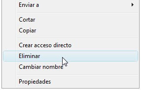
And why on earth would "Rename", "Insert page" and "Delete" be so close together?! :o

1st lesson to remember: regularly save file under different names.
2nd lesson: design products which avoid mixing up innocuous actions with potentially project/career-destroying ones.
This would be a good point to refer back to one of Jakob Nielsen's original 10 heuristics:"Error prevention
Even better than good error messages is a careful design which prevents a problem from occurring in the first place. Either eliminate error-prone conditions or check for them and present users with a confirmation option before they commit to the action."
Delete --> You sure? Yes / No e.g. Twitter.
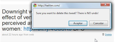
It's interesting to note that Twitter really emphasizes the fact that there is no "undo".I guess google applications have had a big impact on user behaviour and expectations...
- Though shouldn't it be "no undoing"?!
Delete (move to recycling bin) e.g. Yahoo mail or Windows.
Ok for medium - advanced users, and for those who have had a heart attack over some super-important file "disappearing".
However, it's a pain if you're deleting a lot of files and it's not immune to mistakes, but the "Are you sure?" dialogue box is still a good safeguard.
- Delete + Undo (e.g. Gmail) Probably still the safest method AND you get a confirmation message. Though if you really want to delete something, will it even let you?!


BUT it's not that intuitive as a lot of users don't know they have a recycling bin!


