
Monday, 12 April 2010


Wednesday, 7 April 2010
Shock! Horror! Dubious conclusion to Jakob Nielsen's post "Horizontal Attention Leans Left"
"Web users spend 69% of their time viewing the left half of the page and 30% viewing the right half.
[ok so far]
A conventional layout is thus more likely to make sites profitable."
[hmmmmm, profitable?!]
Jakob's conclusion could be right, but not based on this argument alone. It's a bit of a wild leap for someone who is usually so black and white about things.
If he had said:
"Web users spend 69% of their time viewing the left half of the page and 30% viewing the right half. A conventional layout is thus more likely to be more efficient/save users time and energy/make life easier/improve user perception and therefore, possibly as a result make the owners a ton...." well maybe.And there was me relying on Jakob to keep a bit of discipline and order among a world full of snake oil sellers!!! Hey ho.
What do you think?
Monday, 22 February 2010
The long way round is the wrong way round

I'm glad Amazon added the option of "Add to wish list" to their product pages.
Before it was necessary to go into "Wish lists", search for your own list (yes, search!), search for the product (again)...
Well, this was all a few months ago and I can't remember the details, but I know it was a hassle and a chore, - requiring a high level of motivation from the user. - Exactly what not to do if you want someone to use "social web" tools and functions.
So, at least now they show the "add to wish list" on the product page.
It's a lot more comfortable. And there is a drop down if you have more than one wish list. I have a work-related one, a fiction list and another list related to a separate hobby, but could easily have a public "What to buy me for my birthday" list, or a private "gift ideas for grandma" list.
Unfortunately, one big niggle is that if I buy a product, the wish list doesn't automatically update the quantities "desired" and "received", so you have to go through the list manually. The long way round.
Worse still, I often - unintentionally - try to add new reading recommendations I receive to my long wish list, but which, it turns out, I already added and, as a result, see the nonsensical error message:
"Your wish list has been updated.
You specified one or more items that are already on your list."

Please Amazon:
1. Don't let me try to add the same product to my list twice. It's a lot of clicking and time-wasting.
My ideal solution: Show me which books are already on my wish list on the product detail page. The module is already on the page, but should say "Already added to wish list" or "On your list". Also, on the search results page it would be handy to have an icon or something saying "This is on your wish list".
2. If it is even possible to add more than one book at a time, that could be cool, so tell me about it. I dont recall seeing any way to do that.
3. Please, please, please update my wish lists for me when I buy stuff, or at least suggest that I do it. You could send me an email and say, “hey, do you want this list updating?”.
Saturday, 23 January 2010
We are creatures of habit; why it's worth sticking to some design conventions
I was looking to subscribe by RSS to a blog, but could I find the link I was looking for?! A moment of frustration.
Having scrolled up and down, and having tried different pages, I eventually found it.


Having scrolled up and down, and having tried different pages, I eventually found it.

It's big enough you might think, so why didn't I "see" it, despite having looked at it?
It even says "RSS subscription" in capital letters!
Later that same day I was on another website and found the RSS icon easily, despite it being far smaller.

So, I thought, in the first case the RSS icon might be big, but it's also green and round. For whatever reason, the RSS icon has always been orange, and square:

However, later that day, yet another site, and this time the RSS icon is square, though small and GREY, almost transparent. And yet I had no problem "seeing" it.


That must be why I didn't find the first one easily.
However, later that day, yet another site, and this time the RSS icon is square, though small and GREY, almost transparent. And yet I had no problem "seeing" it.

So, it's quite possible that not only does the colour, size and shape count, but also its location (left / right, top / bottom) and its proximity, not only to the content channel or item in question, but also to other page elements.
All these properties: size, shape, number, colour and location work together to make a familiar element recognisable. Not to the mention the fact that many web conventions shape user expectations (logo linking to home page, banner blindness, pop-up aversion among others).
There are various green circles on the blog (top); all competing with each other for your (my) attention, and blurring together with the branding of the site.
The overall effect is essentially an invisibility shield; impenetrable to the quick scan.
Although there may be aesthetic arguments in favour of a consistent colour scheme and original layouts, there are some design conventions that, for the sake of user efficiency and avoiding frustration, are just worth sticking too.
Sunday, 20 December 2009
Erase and rewind: 4 ways to "delete"
Thinking about models for deleting files or messages...
I can think of 4, but which is best?
- Delete (as in now and forever) e.g. Visio. It doesn't matter how long you've been working on that prototype, it can still be gone in less than a second.
And why on earth would "Rename", "Insert page" and "Delete" be so close together?! :o

1st lesson to remember: regularly save file under different names.
2nd lesson: design products which avoid mixing up innocuous actions with potentially project/career-destroying ones.
This would be a good point to refer back to one of Jakob Nielsen's original 10 heuristics:"Error prevention
Even better than good error messages is a careful design which prevents a problem from occurring in the first place. Either eliminate error-prone conditions or check for them and present users with a confirmation option before they commit to the action."
Delete --> You sure? Yes / No e.g. Twitter.
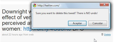
It's interesting to note that Twitter really emphasizes the fact that there is no "undo".I guess google applications have had a big impact on user behaviour and expectations...
- Though shouldn't it be "no undoing"?!
Delete (move to recycling bin) e.g. Yahoo mail or Windows.
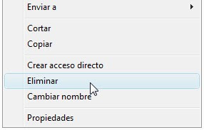
Ok for medium - advanced users, and for those who have had a heart attack over some super-important file "disappearing".
However, it's a pain if you're deleting a lot of files and it's not immune to mistakes, but the "Are you sure?" dialogue box is still a good safeguard.
- Delete + Undo (e.g. Gmail) Probably still the safest method AND you get a confirmation message. Though if you really want to delete something, will it even let you?!


BUT it's not that intuitive as a lot of users don't know they have a recycling bin!

Know of any others?
Tuesday, 8 December 2009
Shopping "basket" or "trolley"?
 - the icon used on Amazon.co.uk
A curious example of where the label doesn't match the image.
I wonder...- Is an image of a trolley easier to identify than a basket?
- Is a trolley more closely associated with shopping?
- Is it a subtle way of encouraging users to spend more and fill up their trolleys rather than a basket?!
- Is this merely the same as the now out-dated floppy disc representing "Save".
- ...or a way to avoid choosing between the British English "Trolley" and the American English "Cart"?

Saturday, 28 November 2009
Google Wave
I love the idea of the Google "wave"; a move forward, away from traditional 1-to-1 email.
BUT, having been using Google Wave for a few days, there are a few things that jump out at me that could be improved.
Obviously it's a beta version or "preview"; some things will be fixed, others are just a question of changing habits and others may continue to confuse or encumber.
We will see.

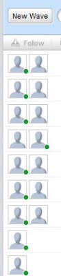
- To start with, I like the fact that you can minimise the different windows individually: it leaves a cleaner working space and is better for convenience and privacy. The only option you see in the centre of the page is "New wave"; remniniscent of the Google search page.

As it is, I end up having to drop down each block in turn:

- Something I really don't like is that it adds my "avatar" to the top of each message; breaking the mental model I have of communicating with others. Currently it looks like the conversation is with 3 others, rather than between myself and 2 others: 3 in total.


- At this point in time you cannot remove someone if you've added someone by accident, which is just encouraging mistakes (and frustration). However, it looks like sooner or later it will be possible.
- It also assumes that we all will personalize our avatars as soon as we sign up, that the photo will be clearer enough to identify people easily, and also that you know what the people look like who you are communicating with.

Unfounded assumptions?

Maybe I'm unusual in not feeling the need to upload my photo.
People I know like to upload a picture of their car, cat, baby, something they identify as being representative of their personality, but not necessarily a passport photo of their face. The exception maybe in company use...
This means that the system of seeing who is in a coversation (or wave or whatever) is not very efficient: it requires holding the mouse over each non-photo to see who is included.
- Also, I figured the difference between a wave and a ping was that the first was more akin to email and the latter to chat.
I liked the idea of a quick ping. However, in reality they appear to be the same.
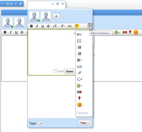
In the image above you can see a ping window over a wave window: both have the same formatting options and you can add other users. The ping window is just smaller than the wave window.
- The search box seems to have been designed by programmers for programmers, the geek influence and design of this program is loud and clear(!). "Query", commands, and "Submit" not "Search"?!
- Another disadvantage to me is that it's a separate account to my email account, which means another account to manage. Maybe with time they will get rid of gmail and integrate the accounts (I would be quite pleased to be honest).

- It has the novelty factor of being able to see the other person typing in real time, - which makes it more interactive than email, though possibly counter-productive if you're watching other people type (slowly, clumsily or otherwise). --It could also lead to mistakes - people seeing things they're not supposed to while you gather your thoughts :o
- Increased functionality: add gadgets e.g. maps, weather, yes/no event organiser, and I assume these gadgets will only increase in number.
- The save search function could be useful and the way to find a recent wave (clicking on a contact) is nice.

- But most importantly, adios to long forwarded emails messages and downloading mysterious attachments. Hoorah!

Subscribe to:
Posts (Atom)

