Monday, 22 February 2010
The long way round is the wrong way round
Saturday, 23 January 2010
We are creatures of habit; why it's worth sticking to some design conventions
Having scrolled up and down, and having tried different pages, I eventually found it.
However, later that day, yet another site, and this time the RSS icon is square, though small and GREY, almost transparent. And yet I had no problem "seeing" it.
Sunday, 20 December 2009
Erase and rewind: 4 ways to "delete"
Thinking about models for deleting files or messages...
I can think of 4, but which is best?
- Delete (as in now and forever) e.g. Visio. It doesn't matter how long you've been working on that prototype, it can still be gone in less than a second.
And why on earth would "Rename", "Insert page" and "Delete" be so close together?! :o

1st lesson to remember: regularly save file under different names.
2nd lesson: design products which avoid mixing up innocuous actions with potentially project/career-destroying ones.
This would be a good point to refer back to one of Jakob Nielsen's original 10 heuristics:"Error prevention
Even better than good error messages is a careful design which prevents a problem from occurring in the first place. Either eliminate error-prone conditions or check for them and present users with a confirmation option before they commit to the action."
Delete --> You sure? Yes / No e.g. Twitter.

It's interesting to note that Twitter really emphasizes the fact that there is no "undo".I guess google applications have had a big impact on user behaviour and expectations...
- Though shouldn't it be "no undoing"?!
Delete (move to recycling bin) e.g. Yahoo mail or Windows.

Ok for medium - advanced users, and for those who have had a heart attack over some super-important file "disappearing".
However, it's a pain if you're deleting a lot of files and it's not immune to mistakes, but the "Are you sure?" dialogue box is still a good safeguard.
- Delete + Undo (e.g. Gmail) Probably still the safest method AND you get a confirmation message. Though if you really want to delete something, will it even let you?!

BUT it's not that intuitive as a lot of users don't know they have a recycling bin!
Saturday, 28 November 2009
Google Wave
- To start with, I like the fact that you can minimise the different windows individually: it leaves a cleaner working space and is better for convenience and privacy. The only option you see in the centre of the page is "New wave"; remniniscent of the Google search page.

- At this point in time you cannot remove someone if you've added someone by accident, which is just encouraging mistakes (and frustration). However, it looks like sooner or later it will be possible.
- It also assumes that we all will personalize our avatars as soon as we sign up, that the photo will be clearer enough to identify people easily, and also that you know what the people look like who you are communicating with.

- Also, I figured the difference between a wave and a ping was that the first was more akin to email and the latter to chat.
I liked the idea of a quick ping. However, in reality they appear to be the same.

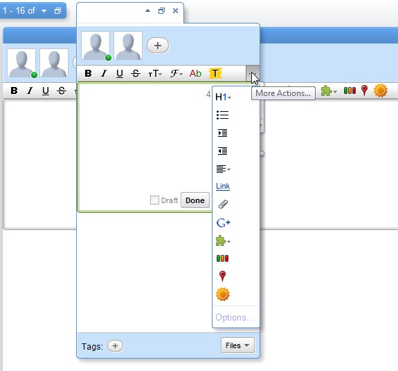
In the image above you can see a ping window over a wave window: both have the same formatting options and you can add other users. The ping window is just smaller than the wave window.
- The search box seems to have been designed by programmers for programmers, the geek influence and design of this program is loud and clear(!). "Query", commands, and "Submit" not "Search"?!
- Another disadvantage to me is that it's a separate account to my email account, which means another account to manage. Maybe with time they will get rid of gmail and integrate the accounts (I would be quite pleased to be honest).

- It has the novelty factor of being able to see the other person typing in real time, - which makes it more interactive than email, though possibly counter-productive if you're watching other people type (slowly, clumsily or otherwise). --It could also lead to mistakes - people seeing things they're not supposed to while you gather your thoughts :o
- Increased functionality: add gadgets e.g. maps, weather, yes/no event organiser, and I assume these gadgets will only increase in number.
- The save search function could be useful and the way to find a recent wave (clicking on a contact) is nice.

- But most importantly, adios to long forwarded emails messages and downloading mysterious attachments. Hoorah!
Saturday, 23 May 2009
Why do people type the URL in google and not in the browser's address bar?
The answer is simple: it's usually quicker, requires less mental effort and is generally more fruitful to find the correct website address in a search engine than attempt to do so in the brower's address bar.
Let's see why that is:
- Web addresses are difficult to type given the non-semantic elements and punctuation: http://www. my-site ...hyphen or underscore .com, .org or co.uk...?).
- Web addresses can be hard to remember (was it british-airlines, ba, british_airlines, britishairlines...?).
- They normally have to be 100% correct if you type them directly into the browser - although things are improving in this regard.
- When you get the URL wrong, with a browser you get a dead end error page, though this is not the case with the search engines! Compare:

Search engines on the other hand forgive your spelling mistakes, make helpful suggestions and aren't picky about punctuation!
It comes down to basic usability principles - or common sense! In plain English, these are:
- Don't make me think
- Don't expect me to remember
- Forgive my mistakes, to err is human (and so am I)
- Be flexible with alternatives
- Give me an escape route
Perhaps the solution is to permanently replace the address bar with a search box...?
Sunday, 21 September 2008
Postcard from Croatia
Intelligence test no. 1: smiley faces on a ferry timetable:


I assumed the yellow hinge could have something to do with the arm of the door (not in the shot), but the red question mark got me.
Sunday, 3 August 2008
Reliability + responsibility + time saving = trust + loyalty
These events brought to mind the importance of trust in satisfying users whatever the situation, whether online banking, e-commerce, GPS, ATMs or bricks and mortar shopping.
Alan Cooper’s comments about software also came to mind:
What’s Wrong with Software?
Software forgets(Alan Cooper, p65, The Inmates are Running the Asylum, SAMS, 2004)
Software is lazy
Software is parsimonious with information
Software is inflexible
Software blames users
Software won't take responsibility
How is this all related?
Let me explain.
1. E-commerce woes
First off, my credit card was declined when I was trying to book some flights online.
I only use my credit card for occasional purchases, such as flights, car hire and online shopping. Seeing as it's with a British bank, I know they will protect me against online fraud. I trust them and that security makes me more inclined to hit Amazon and lastminute.com from time to time.
Therefore, when the bank declined the purchase, I couldn’t figure out what the problem could be as I’m not the type to max out my limit.
Software is parsimonious with information
It turns out it was declined as a fraud prevention measure. - Good to know they do such things, but fairly infuriating to not be able to rely on my credit card for these rare purchases.
Software won't take responsibility
I should point out I have been with the same bank for more than 10 years and I don't think my spending habits have changed in all that time.
When will their system begin to learn and respect my spending habits?
Software forgets
Software is lazy
A day or so later, an overly-dramatic letter (more suited to a spy agency than a bank) arrives at my home address instructing me to phone them immediately.
So, one international call later and I'm set.
Having said that, there was no apology for having had to phone abroad (my time and money) not to mention for having lost out on the flights I had had my eye on (more of my time and money), but at least it seems I can go back to attempting to book flights online.
2. Online banking mysteries
A slightly more worrying incident also involving my credit card occurred a couple of days later following a trip home.
I logged into my account with the intention of settling the difference on my credit card to avoid paying interest (airport shopping is both genius and dangerous when your flight is delayed by 3 hours!).
Surprise no 2: my credit card no longer appeared on my online statement; that line had just disappeared altogether!
Software forgets
I looked for ways to contact the bank or for some other explanation, - I checked the post, I checked my email, nothing!
Software is, once again, parsimonious with information
I found the option "Add credit card to this account", so I figured I'd give that a go, - partly to save on yet another international call - only to be told that I'm not the title holder of MY card!!
Software is inflexible
My only option was to insist that I am indeed the title holder and the computer promised to look into it within 5 days.
Software is lazy
I crossed my fingers and a few days later I logged back in and there was my credit card statement again. Magic.
3. Communication problems
So now I just needed to pay off the balance. I selected "pay credit card", "whole balance" and this time I got the following error message:
"We are not expecting a payment from you. You either have a zero balance or only need to pay the minimum amount".Now the system is lying to me!? It plainly says amount spent: 60 pounds.
So yes, you guessed it, yet another international call to sort out my "convenient" online banking system.
This time I get put through to a friendly chap called Bob who tells me to pay no attention to unwieldy error messages and to pay the amount of my choosing.
Hmmm. I also mention that my credit card dropped off the system a few days previously and ask whether I should be concerned. Apparently not, happens all the time(!), the credit card company remove them for no apparent reason and the bank people have to put them back on again.
Terrific, instilled with confidence and suspicious that with such high unemployment there could be a lot of cheap, untrained labour about.
If this had been my first experience of this bank, I would have cancelled the account pretty sharply.
Conclusions
“If the interaction is respectful, generous and helpful, the user will like the software and have a pleasant experience.” Alan CooperAlan Cooper was talking about software and an interface, but I think we can extend this to include all aspects of user interaction. In the case of banking, this would mean online services, customer service, whether by telephone or in person, queuing times in branches, ATM interaction and availability as well as the product itself; all of which play a part in the user's or customer’s assessment of their experience.
Build trust to increase customer satisfaction and loyalty
In this case my loyalty is dependent on previous problem-free experience and fear of the unknown, (better the devil you know), rather than on having great confidence in this banking system.
It's no secret that trust and successful e-commerce are very closely related; if users don't trust your company, your employees, your payment system, your privacy policy, your returns policy or just don't get good vibes from the look of your website (expired security certificate, inconsistent graphic design of logo, unexplained changes to the URL etc) they'll probably go elsewhere.
Basic trust building guidelines:
In e-commerce there are certain elements or good practices which encourage trust, for example:
- Transparent privacy policy
- Up-to-date security certificates and content
- Consistent graphic design
- Secure server for transactions
- No hidden costs (delivery, handling fees, suitcases etc)
- Honest, Exclusive, Accurate, Relevant and Timely (H.E.A.R.T) content
- Appropriate behaviour (request for personal details, predictable navigation and interaction)
- Guarantees
I would add to this list the following aspects which are not limited to websites or e-commerce:
- Professionalism
- Competence
- Reasonable behaviour
- Personalized attention
- Excellent customer service
- Easy and quality communication
- Fast responses
- Time-saving
- Accountability and responsibility
Let’s add to that Alan Cooper’s polite software descriptions:
Polite software is…Try to fulfil all 3 wish lists with your products and services in combination and the chances of positive customer satisfaction increase.
- interested in me
- deferential to me
- forthcoming
- has common sense
- anticipates my needs
- is responsive
- is taciturn about its personal problems
- is well informed
- is perceptive
- is self-confident
- stays focused
- is fudgable
- gives instant gratification
- is trustworthy
The aim of any company surely should be to provide great user experience and satisfaction to convert customers into customers for life and natural promoters of your product. Why settle for the minimum possible, particularly when the standards are so low? Customers should be swept off their feet!
Links:
Other tales of the unexpected with ATM machines were shared here recently:
IxDA Studies on Aversions to Making ATM Deposits.
And for a little story about a friend of mine (July has been a bad month for trust and banks), read my previous entry. This time the story takes place in Spain...
Also see:
Good Usability Practices number 1, from usabilitynews.com, Economic Downturn Puts Website Usability into Focus
Outdated information, number 9 of Jakob Nielsen's
Top 10 Mistakes in web design (from 1999)
Books:
Peter Keen, Electronic Commerce Relationships, Trust by Design, Prentice Hall, 1999 See a couple of extracts here.
"Certainty, confidentiality, and privacy”
References:
Alan Cooper, The Inmates are Running the Asylum, SAMS, 2004
Chapter 4, The Dancing Bear, p 65 - 69, What's wrong with software?
Chapter 10, Designing for Power, p161, What makes software polite?
Sunday, 25 May 2008
Visual feedback: keeping the user informed
An example of poor visual feedback could be my previous laptop or current MP3 player; both have an initial plain black start-up screen. I hit the "on" button and nothing appears to happen, so I hit it a few more times, - probably doing more harm than good,- until at last something changes on the screen.
...and there it is, the key to visual feedback; the fact that something has happened or is in the middle of doing something has to be obvious. If I don't notice that something has changed, I won't know or believe it has.
Seems obvious, right? But so many times the difference is so subtle or so slight that the fact that something has changed goes unnoticed.
We, as users, need the system to tell us its state. A start-up screen of any colour other than black would let me know my hitting the "on" button had turned on the machine and that I should hang on for a second or two (rather than repeatedly hitting the same key harder and harder more and more impatiently!).
Effective visual feedback can be achieved by a change in the layout of the elements on screen, or a change in their colour, tone, size or shape, or a combination of the above, (colour alone is not recommended for accessibility reasons).
Online forms and sign-up processes are common examples of where visual feedback is required in the online world, whether or not it is actually provided. Let's take a look at some good examples:
Línea Directa Insurance 1
Línea Directa Insurance 2The difference between the first and second screen is immediately apparent on account of the colours and shading. The instructions also indicate the fields which require attention; the user would notice such a change and not expect to see the confirmation screen until she had made the relevant changes.

Facebook, wrong password
Given the site's blue and white colour scheme, a big pink box attracts the user's eye. Helpful hints are also provided to help the user on his way.
My Family sign in page. Another classic use of colour and shading.The message that appears at the top of the screen makes the rest of the form shift down the page; a movement which attracts the user's attention.
Also notice that the actions buttons don't activate until all the information has been gathered.
Photo Bucket's error message goes one step further: not only does it include the standard error icon (an important visual clue) and some alternative user names, it actually points out the field in question so there can be no mistake as to where the error lies. A change in the colours used and shading can also be seen.
And finally, a step away from error messages, Nextel's character counter let's you know how many characters you have typed (instead of just telling you the maximum allowed). A great help for all of us who do not see communicating an idea in terms of numbers of characters!Also see:
Jakob Nielsen's Alertbox: Top 10 application design mistakes (mistake no. 4)
Signal vs Noise: Web Interface Design Tip: The Yellow Fade Technique
Tuesday, 29 April 2008
4 causes of daily frustration

I recently published on everything UX's Spanish sister site, todofluye.tumblr.com these 4 everyday objects that are a cause of frustration in my day-to-day life.
- The first item are the doors at the entrance to the Madrid underground
In general the Metro de Madrid trains run very well and the system is kept clean and prices low. However, the doors are extremely heavy and I don't know how people with their hands full or who are physically slight manage!
Ironically, a few months ago, these blue stickers appeared on some doors claiming they were easy to open; a clear sign that their poor usability is at least recognized by those responsible.
I seriously wonder if this is a half-started project or a just bad joke; there's nothing easy about opening these doors. The technique required is the same as with the rest of the doors, if someone ahead of you opens one, let the door swing, make the most of the momentum and open it in the opposite direction. If you try and sneak through after someone else, you'll just end up trapped by it (no joke!).
No evidence of user-centred design here. - The office water cooler
This machine not only often refuses to pour water, (you have to shake the whole machine to get rid of the trapped air), but it also has a mystery, red emergency button. None of us can fathom out what this button is for!
An example of the need for designing a product that does it's main function very well, leaving secondary options hidden, though intuitive. - A laptop keyboard with the Function button sitting in the place of the Control button
This is extremely frustrating when using - or trying to use - keyboard shortcuts. I often end up thinking I've copied some text only to find that I'm typing vvvv instead of pasting!
A good reason for following standards! - The false checkbox of a pop up window from an antivirus with a trial period
Q. How can I get rid of this pop up window at start up?
A. I either have to buy the product, or uninstall the antivirus and download a new one.
Fair enough, but the false checkbox which cannot be selected - despite its appearance - and the text "Check box to not see this message anymore" has tricked me at least a dozen times into trying to select it!
Annoying someone into buying your product is not a great user experience!