Sunday, 20 December 2009

Erase and rewind: 4 ways to "delete"

Thinking about models for deleting files or messages...
I can think of 4, but which is best?

  1. Delete (as in now and forever) e.g. Visio. It doesn't matter how long you've been working on that prototype, it can still be gone in less than a second.

    And why on earth would "Rename", "Insert page" and "Delete" be so close together?! :o

    Visio-delete-page-function

    1st lesson to remember: regularly save file under different names.

    2nd lesson: design products which avoid mixing up innocuous actions with potentially project/career-destroying ones.

    This would be a good point to refer back to one of Jakob Nielsen's original 10 heuristics:
    "Error prevention
    Even better than good error messages is a careful design which prevents a problem from occurring in the first place. Either eliminate error-prone conditions or check for them and present users with a confirmation option before they commit to the action."

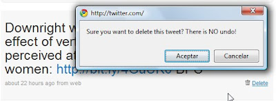
  2. Delete --> You sure? Yes / No e.g. Twitter.

    Twitter-confirm-delete
    It's interesting to note that Twitter really emphasizes the fact that there is no "undo".

    I guess google applications have had a big impact on user behaviour and expectations...

    - Though shouldn't it be "no undoing"?!


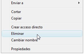
  3. Delete (move to recycling bin) e.g. Yahoo mail or Windows. Windows-vista-Spanish-delete

    Ok for medium - advanced users, and for those who have had a heart attack over some super-important file "disappearing".

    However, it's a pain if you're deleting a lot of files and it's not immune to mistakes, but the "Are you sure?" dialogue box is still a good safeguard.

  4. BUT it's not that intuitive as a lot of users don't know they have a recycling bin!


  5. Delete + Undo (e.g. Gmail) Probably still the safest method AND you get a confirmation message. Though if you really want to delete something, will it even let you?!
    Gmail-delete


Know of any others?

Tuesday, 8 December 2009

Shopping "basket" or "trolley"?

- the icon used on Amazon.co.uk


A curious example of where the label doesn't match the image.

I wonder...
  • Is an image of a trolley easier to identify than a basket?
  • Is a trolley more closely associated with shopping?
  • Is it a subtle way of encouraging users to spend more and fill up their trolleys rather than a basket?!
  • Is this merely the same as the now out-dated floppy disc representing "Save".
  • ...or a way to avoid choosing between the British English "Trolley" and the American English "Cart"?
Well, apparently not the latter, see amazon.com(!):

Saturday, 28 November 2009

Google Wave

I love the idea of the Google "wave"; a move forward, away from traditional 1-to-1 email.

BUT, having been using Google Wave for a few days, there are a few things that jump out at me that could be improved.

Obviously it's a beta version or "preview"; some things will be fixed, others are just a question of changing habits and others may continue to confuse or encumber.
We will see.
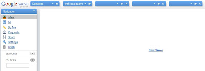
  • To start with, I like the fact that you can minimise the different windows individually: it leaves a cleaner working space and is better for convenience and privacy. The only option you see in the centre of the page is "New wave"; remniniscent of the Google search page.


However, adding icons, labelling with editable keywords or colour-coding the different blocks for instant recognition would make it easier to find the one you're looking for.
As it is, I end up having to drop down each block in turn:

In fact Gmail suffers from the same problem - a ton of links and options that all look the same and require reading - a step back towards tidy looking but laborious controls and navigation.


  • Something I really don't like is that it adds my "avatar" to the top of each message; breaking the mental model I have of communicating with others. Currently it looks like the conversation is with 3 others, rather than between myself and 2 others: 3 in total.


  • At this point in time you cannot remove someone if you've added someone by accident, which is just encouraging mistakes (and frustration). However, it looks like sooner or later it will be possible.

  • It also assumes that we all will personalize our avatars as soon as we sign up, that the photo will be clearer enough to identify people easily, and also that you know what the people look like who you are communicating with.

Unfounded assumptions?

Maybe I'm unusual in not feeling the need to upload my photo.

People I know like to upload a picture of their car, cat, baby, something they identify as being representative of their personality, but not necessarily a passport photo of their face. The exception maybe in company use...

This means that the system of seeing who is in a coversation (or wave or whatever) is not very efficient: it requires holding the mouse over each non-photo to see who is included.

  • Also, I figured the difference between a wave and a ping was that the first was more akin to email and the latter to chat.
    I liked the idea of a quick ping. However, in reality they appear to be the same.


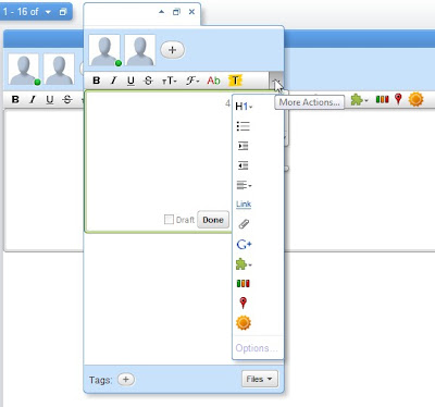
  • In the image above you can see a ping window over a wave window: both have the same formatting options and you can add other users. The ping window is just smaller than the wave window.

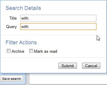
  • The search box seems to have been designed by programmers for programmers, the geek influence and design of this program is loud and clear(!). "Query", commands, and "Submit" not "Search"?!


  • Another disadvantage to me is that it's a separate account to my email account, which means another account to manage. Maybe with time they will get rid of gmail and integrate the accounts (I would be quite pleased to be honest).
What's cool about Google Wave?
  • It has the novelty factor of being able to see the other person typing in real time, - which makes it more interactive than email, though possibly counter-productive if you're watching other people type (slowly, clumsily or otherwise). --It could also lead to mistakes - people seeing things they're not supposed to while you gather your thoughts :o
  • Increased functionality: add gadgets e.g. maps, weather, yes/no event organiser, and I assume these gadgets will only increase in number.
  • The save search function could be useful and the way to find a recent wave (clicking on a contact) is nice.

  • But most importantly, adios to long forwarded emails messages and downloading mysterious attachments. Hoorah!

Saturday, 21 November 2009

Which prototyping tool?

There are quite a number of (flashy) prototyping applications becoming available. So, while trying out the new ones, I thought I'd share my experiences.

For the sake of completeness, I'll be going from paper to the most expensive trial version I can get my hands on!

The prototyping tool candidate list so far:
  1. Paper
  2. PowerPoint
  3. Inkscape
  4. Visio
  5. Axure
  6. JustInMind Prototyper 2.6
  7. Adobe Fireworks
Things I'll be looking out for:
  1. Quick, easy and intuitive: Is it quick to install? Do you need to be a whizz kid, or can anyone pick this up and go without feeling lost and out of their depth? How much of a learning curve is there?
  2. Communication: Is the result an effective communication tool? Does it need to be supplemented with other documentation? Can it express interaction? - Anything that eliminates the need for extensive text descriptions is good to get projects moving.
  3. Flexibility: Low-fi, hi-fi, compatibility between operating systems, browsers, export to HTML, PDF etc.
  4. Complete: Does the application have everything necessary to get going? Are there stencils or (free) downloads available? Are there online tutorials to help advanced users get the most of the application and quickly shoot up the learning curve?
  5. Robust and error-resistant: Does it crash? Delete pages too keenly? Can I recover earlier versions?
  6. Ergonomically gentle: Too much drag and drop with the mouse is a killer and can lead to or aggravate Repetitive Strain Injury (RSI). Are there keyboard shortcuts? Is there a balance between drag, drop, click, type? Can other peripherals be used?
  7. Value for money: Are the most expensive applications worth their licence fees? Is there a free alternative?

So, let's get started. Today: PowerPoint.

1. PowerPoint
- PowerPoint?! For prototyping?!
- Yes, I had to use it once for a project, a requirement of the client!

Reasons for using PowerPoint for prototyping
  • You're new to prototyping and don't have a specialist application installed.
  • If your client is very Microsoft Office oriented (it happens), and wants to be able to modify the documents, it may be one of the few compatible formats available for client - consultant collaboration.
Who should or would use PowerPoint for prototyping
An expert user of PowerPoint for presentations new to prototyping.

If you know how to set up templates, make graphically attractive presentations, use animation and links, you won't lose too much time and the end result can be decent.

It can be quicker than trying to figure out Visio say, especially if you download these web controls and widget stencils (without them, I would probably not bother).

Pros and cons of prototyping in PowerPoint
Pros:
  • Being a visual format, it can be a good way to communicate users' needs.
  • You can copy-paste away - images and text.
  • Colours, animation, images and links can give it quite a bit of life and dynamism.
  • Just about everyone has some way of viewing a Powerpoint document, even if in Google Docs, Open Office...
  • It's fairly stable and can handle a lot of images (I've done 150+ page benchmarkings full of screen shots and not had any trouble with it crashing).
Cons:
  • Unless you're all using the same version of PowerPoint, things will inevitably move out of place.
  • It's not meant for prototyping, so there aren't a great deal of stencils available, although this number does seem to be growing.
  • It's not likely to have the slick, professional look other prototyping or graphic design tools can offer, especially if you're using anything prior to Office 2007.
  • If you have barely used Powerpoint, it's not going to be the best prototyping tool for you as it is not intuitive.
  • It's not a tool user interaction designers can use if they want their peers to take them seriously! It's not a cool kids' tool!

Sunday, 15 November 2009

Which button gets me a latte?

2 giant red buttons, one orders a latte, the other nuclear war.

President - Hang it all. What's the point? It's a disaster.

All advisors - Stop!! stop! No! Don't! Wait!

Advisor 1 - That button launches all of our nuclear missiles.

President - Well then, which button gets me a latte?

Advisor 2 -Erm, that would be the other one sir.

President - What idiot designed this thing?

Advisor 3 -You did sir.

President - Fair enough.
Wilson, fire somebody!

Wilson - Yes sir, Mr President!

From the excellent Monsters vs Aliens, go see it!

Saturday, 26 September 2009

Interaction for impact in advertising

Some examples of particularly spectacular advertising. The first one uses eye-tracking technology for a bit of user interaction!

The ads are from different awareness-building campaigns run by Amnesty International. As per usual, they can teach for-profit organisations a thing or two about persuability!

In the first example, the image, displayed on the side of the bus stop shows a woman being beaten by her husband, but, as soon as someone looks at the advert, the image changes to a photo of happy couple. The caption reads: "It happens when nobody is looking".


The second one shows a young boy walking towards you carrying a machine gun. The image carefully blends into the actual environment.


The third and final one, also from Amnesty International, splits the image in 2 horizontal parts: the upper one shows the top half of a healthy woman in a safe environment screaming to be heard, whilst the bottom one shows a girl from the waist down living in poverty and in the clutches of someone else. Together, the 2 parts make one woman. The caption reads: "Make some noise for those who cannot be heard".


Saturday, 30 May 2009

Google Insights for Search great for SEO keywords

As I'm getting involved more with SEO, or Search Engine Optimisation, I've been experimenting with the tools available.

Here I wanted to mention 2 Google tools which can be used for identifying keywords: Google Trends and Google Insights for Search.

Google Trends has generally been considered a useful tool for SEO.
By discovering the lastest popular search terms, webmasters hope to discover which keywords to incorporate on their website or what topics to write about in order to attract more readers and bump up the position of the website on the search engine results page.

The data provides inspiration and new content can be created - or updated - based around these trends.

To be honest, I found Google Trends interesting to play though a little too limiting to be really useful. Having said that, Nicholas Prudhon does have a great introductory article precisely on how to use Google Trends for SEO purposes.

But, the other day, I got a lot more excited about the newer Google Insights For Search (version Beta).
In reality the 2 tools are very similar, but Insight additionally provides:
  • Greater accuracy through the use of category filters
  • Suggestions from current top search terms and terms that are on the rise
  • Greater use of graphics for data visualization.
  • Extra bits of info which is useful when it comes to identifying the best keywords for your users at this moment in time and in relation to their geographical location.
...and the more user-centred the information is, the better.

Let's look at some examples.

Using these tools you can also easily spot interesting seasonal variations. For example, when comparing "usability, interaction design, user experience, interaction design, seo" (you can compare up to 5 terms at a time), work-related searches such as these drop off around the end of the year the world over, while for obvious reasons more commercial searches shoot up.

On a local scale, if we compare searches for "usability" in the UK, with "usabilidad" in Spain, while there is a drop off for both terms during July and August, in Spain these searches completely flatline, reflecting the reduced working hours of the summer months and the tendency for offices to close entirely during August.

"Usability", UK, all years:


"Usabilidad", Spain, all years:

This information can help you plan and prioritise your web work. For example, with "usabilidad" it would make sense to redesign or do backend updates and testing over the Christmas period, and release articles regularly January to July and September through to November.

From these graphs we can also see that "usability" only took off in Spain in 2006 and that, in both countries, this term is in decline, which may mean there is a better term to optimise for.

This is precisely where Insights is much more useful as it includes top related terms as well as rising searches providing alternatives and ideas.


One of the trickiest aspects is checking that the term you are looking for only has one meaning or use, especially in the case of acronyms. This is less of a problem if you are comparing search terms of 2 or more words, eg. "web usability" ("web" providing the context), as opposed to "hci" which may have more than one definition.

In both cases, if the search throws up some news articles, you can tell if the results are relevant or not. For example, in the case of HCI (human-computer interaction), a sudden peak in Spain in February was sadly not due to greater interest in this field, but rather a Government program offering tax benefits to businesses that help their employees have access to home computers! (hogares conectados a internet).

However, with Insights you can also filter the search through categories such as Internet, Beauty, Online Communities, Business, Sport etc, giving you much more accurate results.


It's still worth checking in Google, Wikipedia and/or a dictionary just how many definitions exist for a term so that you know that the trends you're seeing are actually related to the meaning you have in mind and other definitions are not being mixed in, leading to false results. That way you can modify the choice of terms you're comparing if necessary.

Saturday, 23 May 2009

Why do people type the URL in google and not in the browser's address bar?

- A question often asked (incredulously) by web teams looking at their data logs!

The answer is simple: it's usually quicker, requires less mental effort and is generally more fruitful to find the correct website address in a search engine than attempt to do so in the brower's address bar.

Let's see why that is:
  1. Web addresses are difficult to type given the non-semantic elements and punctuation: http://www. my-site ...hyphen or underscore .com, .org or co.uk...?).
  2. Web addresses can be hard to remember (was it british-airlines, ba, british_airlines, britishairlines...?).
  3. They normally have to be 100% correct if you type them directly into the browser - although things are improving in this regard.
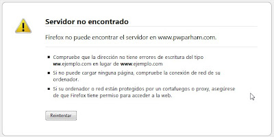
  4. When you get the URL wrong, with a browser you get a dead end error page, though this is not the case with the search engines! Compare:
Server not found error message

Google results page with suggestions
Search engines on the other hand forgive your spelling mistakes, make helpful suggestions and aren't picky about punctuation!

It comes down to basic usability principles - or common sense! In plain English, these are:
  • Don't make me think
  • Don't expect me to remember
  • Forgive my mistakes, to err is human (and so am I)
  • Be flexible with alternatives
  • Give me an escape route
In conclusion, search engines are more generous than browers in all of these aspects, cause less frustration and make life easier. Just what good design is all about!
Perhaps the solution is to permanently replace the address bar with a search box...?

Wednesday, 4 February 2009

Users @lycos.com, the last to hear about the end of Lycos mail?

Imagine my surprise when I hear from Amazon I had better change my registered email address because in a couple of weeks my lycos email address will cease to exist and I'll be in a spot of bother if I want to buy anything from them!

Luckily for me this makes good business sense to Amazon: much better to send out mails than risk angry and frustrated customers who might just go elsewhere if they can't prove they are who they say they are and clog up customer service resources in the meantime.

But couldn't Lycos mail have sent us a farewell email? a little bit of warning, so we could forward things like mad and update accounts as required?

Or maybe they did and it got filed in their over-zealous spam folder system...

Oh well, goodbye Lycos mail, hello...?

Update!
Clarification straight from the horse's mouth:
" The reports and rumors that you are hearing about an impending shutdown concern Lycos.co.uk and their European services such as Lycos Mail UK (@lycos.co.uk) and the Tripod UK hosting. It is Lycos.co.uk that has announced their shutdown. The UK company licensed the Lycos/Tripod name and some technology years ago, but has NOTHING to do with the original/core Lycos and/or Tripod services that are run here in the USA."

Friday, 16 January 2009

Nerdy film, Helvetica, recommended!

Prompted by the 50th birthday of the Swiss typeface Helvetica last year, the documentary by Gary Hustwit looks at the astonishing prevalence of Helvetica in the signs and logos of the urban landscape that surrounds us.

Those interviewed generally belong to either the Helvetica is great or Helvetica is dull camp: control and restraint versus creativity and free expression, legibility versus visual communication, old versus new - there's no sitting on the fence with this one!

The joy and enthusiasm for the work of the cheerful typeface designers interviewed is definitely the best advertisement I've seen for any profession!

You should at least have a mild interest in design before thinking about watching it...

Saturday, 3 January 2009

The uncertain future of the computer mouse: retirement, longevity ...or evolution?

The computer mouse's 40th birthday has created great debate as to whether it's time for its dignified retirement or whether it could go on to be around for some time to come.

Arguments in favour of its retirement:
  1. Repetitive Strain Injury (RSI)
  2. Anything being 40 years old related to computers is a rare phenomenon, and automatically assumed obsolete
  3. There must be a more futuristic, gestural Minority Report-style alternative, right?!

Arguments against:
  1. It does the job
  2. It's cheap
  3. It's robust. Let's face it, it's one of the few pieces of computer equipment that never breaks

However, what I expect and have been expecting to occur for some time - though it doesn't seemed to have happened - is not for the mouse to retire, but for it to evolve.


Key characteristics of my ideal Future Mouse would be:
  • Future mouse makes use of opposable thumbs (much like a TV remote control)
  • Future mouse doesn't require your arm to be lifted, pushing out your shoulder and tiring your wrist: it would be a lapmouse (goodbye RSI)
  • Future mouse does not require any strength: it requires a gentle squeezing rather than clicking
  • Despite being a lapmouse, it would also work in the conventional manner, on top of the table (it's extremely versatile, you see)
  • It wouldn't feel like such a hard plastic, but more of a ball of putty (could be quite a satisfying combination of a stress ball and work tool, - improving the user experience)
  • Being futuristic, it would of course be extremely green, made of biodegradable plastic perhaps
Well, time will tell...!

However, should the mouse retire suddenly, I only hope individuals, hardware companies and town councils find some way to recycle all that plastic! :-o


Related reading: